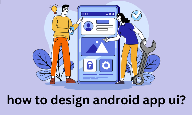
Designing an Android app UI is more than just arranging buttons and text it’s about creating an intuitive, engaging experience that keeps users coming back.
A well-crafted UI makes it easy for users to navigate the app, understand its features, and complete tasks effortlessly. With millions of apps competing for attention, a clean and responsive design can set your app apart.
Consistency, accessibility, and performance are key factors that can make or break the success of your app. A thoughtful design not only attracts users but also builds long-term engagement and trust.
Best Practices for Designing Android App UI
This guide will walk you through the essential steps of designing an Android app UI, from understanding user needs to refining the final product.
Whether you’re a beginner or an experienced designer, mastering these principles will elevate your app’s user experience.

Understanding the Basics of UI Design
UI design (User Interface Design) focuses on creating visually appealing and functional interfaces that users interact with.
It is an essential aspect of app and website development, ensuring that users can navigate and engage with the product smoothly and intuitively.
UI design involves everything from layout, buttons, colors, typography, and icons to how they are arranged and interact with each other.
A well-crafted UI enhances the user experience (UX), which refers to the overall feel and satisfaction users have while using a product.
Key Principles of UI Design
These are the Key Principles of UI Design for an android app.

Simplicity
Simplicity is one of the most crucial principles in UI design. A simple interface reduces the cognitive load on users, making it easier for them to understand and interact with the app.
The goal is to remove unnecessary elements and focus on what truly matters, ensuring that users can easily find and use the features they need.
Clean layouts, intuitive icons, and minimal text help streamline the experience and avoid overwhelming the user with excessive choices.
Consistency
Consistency refers to the uniform use of design elements, behaviors, and interactions across the entire interface. This includes consistent use of color schemes, fonts, buttons, and icons.
By maintaining consistency, users can quickly familiarize themselves with the interface, reducing the learning curve and helping them navigate with ease.
Consistency creates a sense of predictability, allowing users to understand how to interact with the app without confusion.
Responsiveness
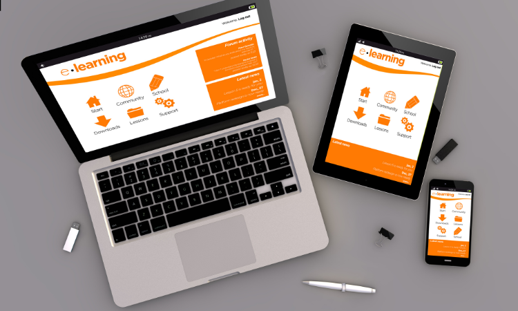
A responsive UI ensures that the interface adapts to different devices, screen sizes, and orientations. Whether a user is on a smartphone, tablet, or desktop, the interface should adjust seamlessly to provide an optimal experience.
This involves elements such as scalable graphics, fluid layouts, and flexible navigation that maintain usability and aesthetics across all platforms.
Responsive design is crucial in today’s multi-device world, enhancing accessibility and user satisfaction.
Accessibility
Accessibility in UI design ensures that all users, regardless of their abilities, can interact with and navigate the app effectively.
This includes making sure that the interface is compatible with screen readers, providing sufficient color contrast for visibility, and ensuring that interactive elements are easy to use for people with disabilities.
Prioritizing accessibility helps create an inclusive experience for a broader audience, ensuring that everyone, including those with visual, auditory, or motor impairments, can use the app without barriers.
Planning the App’s UI Design
Designing an app’s user interface (UI) is a foundational step in creating a seamless user experience.
This phase involves careful consideration and detailed planning to ensure the app is intuitive, visually appealing, and fulfills its purpose. Let’s break it down based on the provided points.
Defining Your Target Audience
The first step is to clearly identify who the app is being designed for. Understanding your target audience involves analyzing their demographics, preferences, behaviors, and pain points. Ask yourself:
Who will use the app, and why? For example, if you’re targeting tech-savvy users, the design might lean toward modern trends, while a broader audience might require a more straightforward and accessible layout.
This clarity ensures the UI is tailored to meet user needs effectively.
Setting the Goals of the App: What Should Users Achieve
Every app serves a purpose whether it’s simplifying tasks, entertaining users, or providing information. Clearly define the app’s goals, focusing on what users should accomplish with minimal effort.
For instance, is the app meant to streamline productivity, facilitate communication, or act as an e-commerce platform? Once the goals are set, they act as guiding principles throughout the design process, ensuring all elements align with the desired user outcomes.

Creating Wireframes and Mockups
Wireframes and mockups are essential visual tools for mapping out the app’s structure and design.
Wireframes provide a skeletal blueprint of the app, focusing on layout, navigation, and functionality, while mockups bring this blueprint to life with colors, typography, and graphic elements.
These early designs help visualize the user journey, identify potential usability issues, and gather feedback before delving into full-scale development.
Choosing the Right Design Tools
Selecting the appropriate design tools can streamline the entire design process. Popular options include:
Figma: Perfect for collaborative design, allowing teams to work simultaneously on projects.
Sketch: Known for its intuitive interface, ideal for macOS users.
Adobe XD: Offers robust integration with other Adobe products and powerful prototyping features.
The choice of tool depends on factors like team preferences, required features, and compatibility with the development process.
Elements of Android App UI Design
Designing an Android app’s UI involves several crucial elements that work together to create a visually appealing and user-friendly interface. Here’s a breakdown of the key components:

Layouts & Views
Layouts act as the structure or blueprint of the app’s UI, determining how elements are arranged on the screen. Common Android layouts include:
- LinearLayout: Aligns elements in a vertical or horizontal sequence.
- RelativeLayout: Allows views to be positioned relative to each other or the parent container.
- ConstraintLayout: Offers flexibility for complex designs, with easy-to-use constraints for positioning.
- FrameLayout: Designed for displaying a single child view or stacking views on top of each other.
- Views, on the other hand, are the building blocks of the UI, representing visual elements like buttons, text, or images.
Components
Android UI components are interactive elements that allow users to interact with the app. These include:
- Buttons: For user actions like submitting forms or navigation.
- TextFields: For user input, like entering names or email addresses.
- ImageViews: To display images.
- RecyclerViews: For displaying scrollable lists of items.
- Navigation Components: Such as BottomNavigationView and NavigationDrawer for intuitive app navigation.
Typography
Typography plays a significant role in ensuring readability and maintaining a consistent visual hierarchy. Android apps often follow Material Design guidelines for typography, emphasizing:
- Fonts: Choose clean and modern fonts like Roboto (the default for Android).
- Font Sizes: Use a hierarchy with larger sizes for headings and smaller sizes for body text.
- Line Spacing: Maintain appropriate spacing for better readability.
- Text Alignment: Keep it consistent with the app’s overall design and language direction.
Colors
Colors set the tone and personality of the app. Effective use of colors involves:
- Primary & Secondary Colors: Define the app’s theme and branding.
- Accent Colors: Highlight important elements like buttons or links.
- Backgrounds: Choose colors that contrast well with text for optimal readability.
- Material Design Palette: Use Material Design’s color guidelines to ensure harmony and accessibility.
Following Android’s Design Guidelines
To create consistent and user-friendly apps, adhering to Android’s design principles is crucial. These guidelines ensure that the app feels intuitive while meeting user expectations across devices. Below are key aspects to focus on:

Material Design
Material Design is Android’s official design system that emphasizes simplicity, usability, and aesthetics.
It introduces clear design patterns, like cards, shadows, and responsive animations, to guide users seamlessly through the app.
With its focus on hierarchy, meaningful motion, and adaptive layouts, Material Design ensures consistency and functionality.
Accessibility
Making apps accessible means accommodating diverse users, including those with disabilities. Android developers must integrate features like TalkBack (screen reader), clear focus indicators, scalable fonts, and color contrast adjustments.
A commitment to accessibility fosters inclusivity and a wider audience reach.
Platform-Specific Guidelines
Android’s guidelines address platform-unique aspects like navigation drawers, floating action buttons, and app bars.
Developers must align designs with these standards, ensuring compatibility with Android’s ecosystem and delivering a polished experience across devices.
Responsive Design and Adaptability
Responsive design ensures apps function seamlessly across various devices, regardless of screen size or orientation.
For users who prefer portrait mode, UI designs can focus on optimizing vertical layouts while maintaining adaptability for other scenarios.
Fluid grids, scalable assets, and flexible components allow for a consistent and visually appealing experience. Features like dynamic font resizing and touch-friendly gestures improve usability.
Adaptability ensures that the app works effectively on smartphones, tablets, and other platforms, providing users with a smooth and accessible interface tailored to their needs. Prioritizing responsive design guarantees functionality and user satisfaction across devices.
Navigation Design
Effective navigation design is essential for creating user-friendly and intuitive apps. It ensures seamless transitions and easy access to different sections of the app. Below are key aspects of navigation design:
Types of Navigation
Bottom Navigation: Ideal for apps with three to five primary sections, allowing users to switch between screens easily. It’s placed at the bottom of the screen for quick access.
Drawer Navigation: A hidden menu that slides in from the side, suitable for apps with multiple categories or features. It’s great for conserving screen space.
Tab Navigation: Displays tabs at the top (or bottom) to navigate between related content. It works well for apps with logically grouped sections.
Guidelines for Intuitive Navigation
- Keep navigation simple and consistent across the app.
- Use familiar icons and labels for clarity.
- Ensure the current screen is highlighted so users know their location.
- Minimize the number of steps needed to reach a destination.
Back Stack and Deep Linking Considerations
Back Stack: Maintain a clear back stack to manage user history and transitions. Ensure the back button behaves predictably, returning users to the previous screen.
Deep Linking: Enable deep linking for direct access to specific content within the app, improving navigation and user experience.
A well-designed navigation system enhances usability, making the app more engaging and functional. Let me know if you’d like to explore this further!
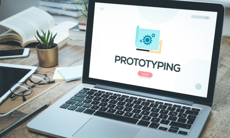
Prototyping and Testing the UI
Prototyping is crucial in UI design because it allows designers to visualize the app’s flow and functionality before development.
Tools like InVision and Adobe XD help create interactive prototypes, making it easier to identify design flaws early.
Prototypes let designers test different layouts, interactions, and user journeys. User testing involves gathering feedback from real users to understand how they interact with the app and identify pain points.
Insights from testing help improve usability and refine the design. Iterating based on feedback ensures the final UI is intuitive, user-friendly, and aligned with user expectations, leading to a better overall experience.
Implementing the Design in Android Studio
Android Studio provides powerful UI toolkits like XML and Jetpack Compose for designing app interfaces. XML allows for creating traditional layouts, while Jetpack Compose offers a modern, Kotlin-based approach for building dynamic UIs.
To implement layouts, developers can use XML for defining views and Jetpack Compose for creating composable functions that handle UI elements.
ConstraintLayout helps design responsive layouts by positioning and aligning components efficiently across different screen sizes.
Adding animations and transitions through Compose or XML enhances user experience, making the app feel more interactive and smooth. Android Studio’s preview feature helps visualize and adjust designs quickly.
Final Touches and Optimization
Final touches and optimization ensure a polished user experience. Optimizing image sizes and using lazy loading reduce memory usage and improve loading times.
Adding touch gestures and smooth animations enhances interactivity and makes the app feel more responsive.
Testing on multiple devices, including different screen sizes and resolutions, ensures consistency and responsiveness across platforms.
Adjusting layouts, fonts, and scaling based on test results helps create a seamless experience for all users. Fine-tuning these elements ensures the app not only looks good but also performs smoothly under various conditions.
How Brandout Can Help You Design Stunning Android App UI?
Designing an intuitive and attractive Android app interface is key to user satisfaction. Brandout’s UI design service creates clean, functional, and visually appealing Android app interfaces.
We focus on making sure your app is easy to use and stands out in a crowded market while providing a solid user experience.
Conclusion
Designing an effective Android app UI involves understanding user needs, planning the structure, implementing designs in Android Studio, and refining through prototyping and testing.
Continuous testing and iteration are key to improving usability and fixing issues early. Staying updated with design trends and best practices helps create modern, user-friendly interfaces.
As you refine your skills and adapt to user feedback, your UI designs will become more intuitive and engaging. A well-designed UI not only enhances user satisfaction but also improves the overall success of the app.
Frequently asked questions:
How to create the UI of an application?
To create an app UI, start by defining the user flow and layout. Use design tools like Figma or Adobe XD to create wireframes and prototypes.
For Android apps, you can implement the design using XML or Jetpack Compose in Android Studio, ensuring consistency and responsiveness across different devices.
Can ChatGPT create UI design?
ChatGPT can’t directly create UI designs but can suggest design ideas, generate sample code, and recommend best practices. It can help with XML or Jetpack Compose snippets and provide design guidance based on your app’s requirements.
How to write Android UI design XML code?
To write Android UI design XML code, open Android Studio and create a new layout file. Use elements like Linear Layout, Relative Layout, or Constraint Layout to define the structure. Customize attributes like width, height, padding, and background to style the components.