Your services page is often the place where visitors form their first serious impression of your business.
It plays a key role in helping them understand your solutions, build trust in your expertise, and take the next step.
In this article, we will cover two things:
- First, smart design ideas to help you structure your services page effectively.
- Second, real-world examples from top websites show how those ideas work in action.
Let’s explore both.
Creative Services Page Design Ideas to Inspire Your Website
Explore 10 practical and modern design ideas to make your services page more effective.
These ideas help communicate your offerings clearly and drive more conversions through better structure and visuals.
1. Grid Layout with Icons
Organizing services in a grid format makes your page clean, structured, and easy to navigate.
Each service can be represented with a unique icon, a short heading, and a 2–3 line description.
This layout works well for both desktop and mobile, letting users quickly scan and identify what they need.
You can include a “Learn More” button under each card to lead users to a detailed service page. Use consistent spacing and modern visuals to ensure a professional feel.
![]()
2. Tabs or Accordion Layout
For websites offering multiple service categories or sub-services, a tabbed or accordion layout is ideal.
It keeps the page clean by allowing users to expand only the sections they’re interested in. For example, clicking “Web Development” reveals all relevant offerings without overwhelming the page.
It improves user experience by reducing scroll fatigue and helping visitors stay focused.
Make sure each tab or accordion has a clear title and a smooth transition animation for better interactivity and visual engagement.
3. Hero Section with Key Services
At the top of your services page, include a bold hero section featuring your most popular or premium services.
Each service can be presented with a compelling image or icon, a headline, and a short CTA like “Book a Consultation” or “Explore More.”
This section immediately communicates what your business does and helps drive conversions by leading visitors to action quickly.
You can also highlight current promotions or customer favorites to draw attention to specific offerings.
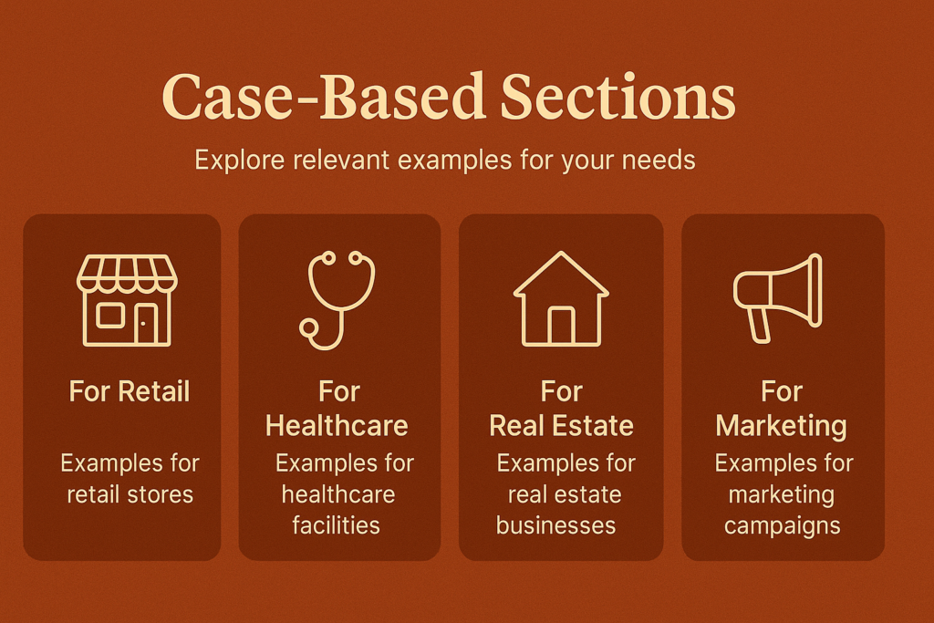
4. Use Case-Based Sections
Instead of just listing services, organize them by real-world problems or client needs.
For example, “Want to grow fast online?” could lead to digital marketing solutions, while “Need a website in 5 days?” might introduce your express web development package.
This customer-first approach makes your services more relatable and allows visitors to see themselves in the solutions.
It creates a narrative that builds trust and improves the chances of engagement or inquiries from potential clients.
5. Visual Timeline or Process Flow
A step-by-step timeline or workflow visual is an excellent way to explain how your service process works.
Use a horizontal or vertical design to show stages like Consultation, Planning, Design, Development, and Delivery.
Icons, short descriptions, and progress lines can make the process easy to digest.
It helps potential clients understand what to expect and builds confidence in your professionalism and structure.
Adding estimated timeframes per step can further enhance clarity and manage client expectations.
6. Comparison Table
If your services come in different packages (e.g., Basic, Pro, Premium), a comparison table helps clients understand what they get at each level.
List services or features on the left and packages across the top. Use checkmarks, highlights, or tooltips to keep it visually clear.
This structure simplifies decision-making, especially for visitors with specific needs or budgets.
Adding CTA buttons like “Select Plan” or “Start Now” under each column can directly lead to inquiries or conversions.
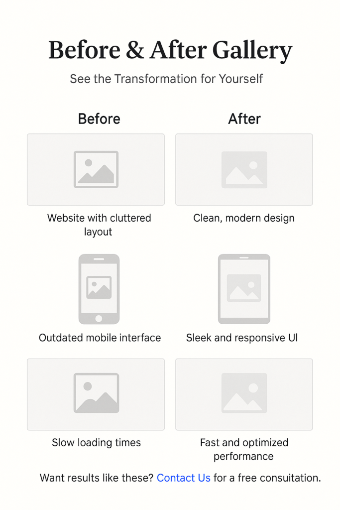
7. Before & After Gallery
A visual before-and-after gallery is powerful for services related to design, branding, SEO, or development.
It shows real transformations you’ve made for previous clients, helping new visitors visualize your impact.
You can include side-by-side images, interactive sliders, or video clips. Supporting each example with a short description of the problem and your solution makes the impact clearer.
This builds social proof and gives you a chance to show the depth and results of your work.
8. Testimonials by Service
Place a relevant client testimonial under each service section to build trust and add credibility.
Instead of having one testimonials section at the bottom, scatter them strategically across the page.
If a visitor is reading about your SEO services, a quote from a happy SEO client can help them feel confident.
Include client names, photos, and company names if possible. Video testimonials work even better.
This approach keeps the page personalized and shows proof of success for each specific offering.
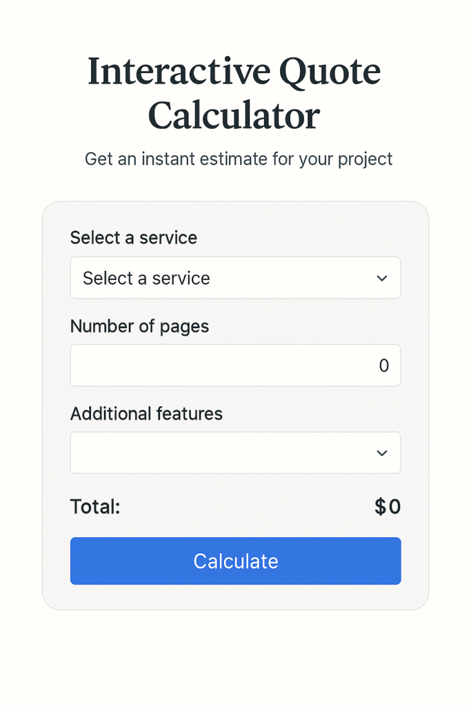
9. Interactive Quote Calculator
An interactive pricing calculator engages visitors and helps them estimate costs based on their selected services.
For example, if a user selects “Website + SEO + Content Writing,” the calculator can show a combined estimate.
This not only saves time but also filters out low-intent users. It’s especially helpful for service businesses that offer custom pricing.
Keep the UI simple, mobile-friendly, and visually appealing, with options to submit the quote request or schedule a consultation at the end.
10. Service Detail Popup or Modal
Instead of directing visitors to new pages for each service, use modals (popups) that open when a user clicks on a service title or button.
This keeps them on the same page while still providing additional information like features, benefits, pricing, and FAQs.
It improves navigation and reduces bounce rates. Make sure the modal design is clean, fast-loading, and mobile-optimized.
Add a CTA inside the pop-up like “Book Now” or “Contact Us” for better conversion opportunities.
Service page design examples:
Here are some real-world examples of well-designed services pages from different industries, each showcasing unique layouts and UX strategies:
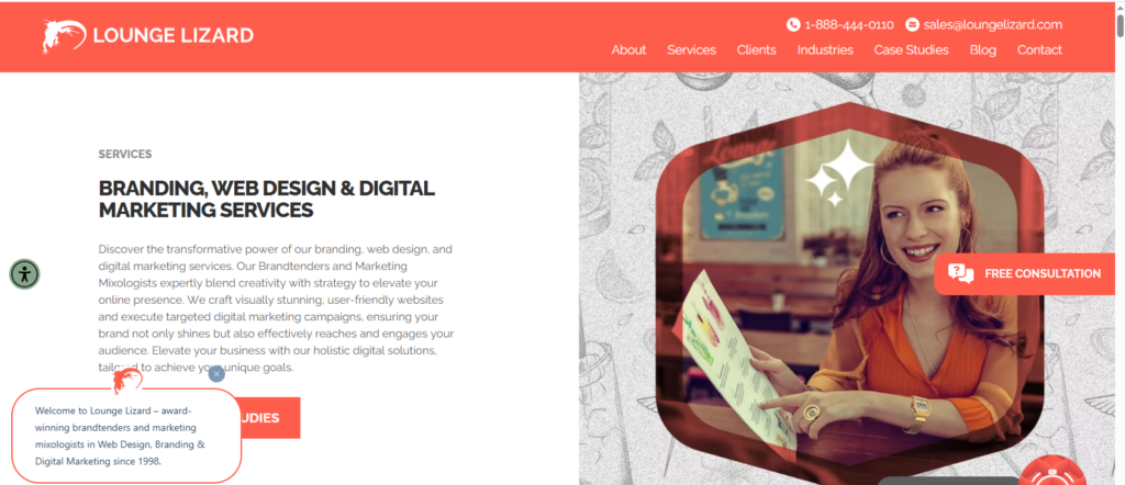
Lounge Lizard
Lounge Lizard’s services page uses a bold and confident layout. Services are displayed in separate blocks with a catchy headline, an image or icon, and a brief description.
When you click on a service, you are taken to a dedicated page that explains it in more detail with client results, testimonials, and CTAs.
This structure works by grabbing attention quickly and then leading users into deeper, more informative pages.
It’s ideal for businesses that want to showcase both creativity and results without overwhelming visitors at first glance.
SmartSites
SmartSites presents its digital services in boxes, each with an icon, description, and a “Learn More” button.
When clicked, each service opens a dedicated page with benefits, case studies, and testimonials.
This helps potential clients explore services at their own pace. The consistent CTA placement throughout the page guides users toward making an inquiry.
It works well because it’s structured for conversions and provides social proof right where it’s needed, increasing user confidence.
Clay Agency
Clay uses scroll-based storytelling with animations to present its services.
Instead of traditional listings, services unfold as users scroll, making the experience interactive.
Each section includes a large image, clear headings, and minimal but impactful text.
This setup impresses visitors visually while communicating the value behind each service.
It works especially well for high-end clients looking for creative and UX-focused services, as the page itself demonstrates the agency’s skill in design and branding.
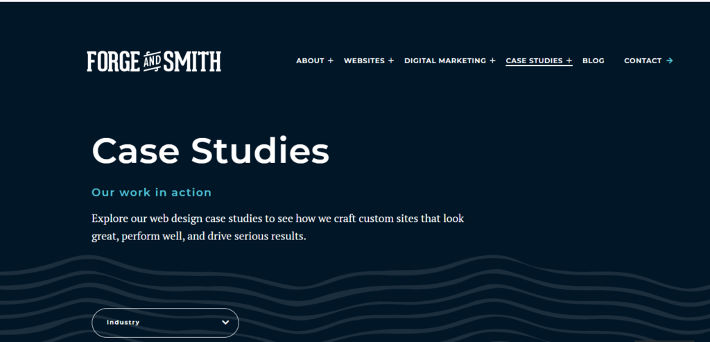
Forge and Smith
Forge and Smith’s page explains their services through a timeline format. Visitors can see each step of the service journey from strategy to delivery.
This is combined with clear icons, descriptions, and helpful links to case studies and blogs.
By showing the full process, the agency builds transparency and trust.
It works because clients know exactly what to expect, reducing confusion and increasing the chances of getting quality leads.
Kimp
Kimp uses a landing page-style layout with a focus on clear visuals, pricing comparisons, and CTAs.
Visitors can scroll through different sections explaining design services, benefits, and FAQs.
A standout feature is their comparison table that lets users choose between plans.
The layout helps users quickly find what they need, compare offerings, and decide.
It works effectively by simplifying the decision-making process and guiding users straight to sign-up or contact actions.
Salted Stone
Salted Stone structures its services page around real-world business challenges.
Each section opens with a strong headline that describes a problem, followed by a solution in the form of their service.
They support this with examples and subtle animations. This storytelling method keeps visitors engaged and helps them relate to the services.
It works because it speaks directly to the user’s pain points, positioning the agency as a partner rather than just a provider.
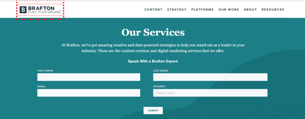
Brafton
Brafton’s page is detailed but well-organized. It divides services by type, such as content writing, SEO, or video.
Each section includes service descriptions, performance stats, client logos, and FAQs.
The layout makes it easy to understand what each service includes and what kind of results to expect.
It works by being transparent and informative, which is ideal for businesses looking to invest in long-term content strategies. It also helps build authority and trust.
Looking to turn your services page into something this effective?
At Brandout, our website design & development service includes crafting high-performing services pages that not only look great but also guide visitors toward taking action.
Whether you need a fresh layout, better content structure, or a complete page redesign, we’ll build a services page that reflects your brand and drives results.
Final Verdict:
As you have now seen, the design of your services page plays a key role in how visitors understand and respond to your offerings.
From layout choices to content flow, every detail matters when it comes to building trust and guiding action.
Applying the right structure can turn a basic page into one that actually drives results.
Most Asked Questions:
Why is a well-designed services page important for a website?
A services page is often where potential clients decide whether to contact you.
A clear, structured design helps visitors understand what you offer, builds trust, and encourages them to take action.
How many services should I list on my services page?
It depends on your business, but ideally, 3 to 6 main services work well.
Too many options can overwhelm users. You can group sub-services under main categories or use tabs to organize them better.
What elements should every services page include?
A good services page should include service titles, short descriptions, icons or images, a CTA (Call to Action), testimonials or results, and links to deeper pages if needed.
How can I make my services page more engaging?
Use visual layouts like grids, add client reviews, include a short “how it works” process, and keep the language focused on the customer’s problem and your solution.
Interactive elements like quote calculators or accordions also help.
Should I use a separate page for each service or keep them all on one?
If your services are detailed and distinct, separate pages work better for SEO and user clarity.
For simpler offerings, a single-page layout with sections and scroll navigation is enough.