Creating an FAQ (Frequently Asked Questions) page is not just about listing common queries.
It’s about helping users find answers quickly, reducing customer support load, and improving the overall website experience.
A well-structured FAQ page can build trust, address objections, and increase conversions. The key is in how you present the information.
From interactive layouts to visual and category-based formats, the design of your FAQ page plays an important role in user satisfaction.
Below are 17 creative, practical, and user-friendly FAQ design ideas that can make your support section more effective and engaging.
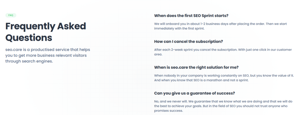
What is an FAQ page?
An FAQ page (Frequently Asked Questions page) is a section on a website where common questions from visitors or customers are answered in a simple, clear format.
It helps users quickly find answers about products, services, policies, or processes, without needing to contact support.
Typical questions include:
- How do I place an order?
- What is your return policy?
- How long does shipping take?
A good FAQ page improves user experience, builds trust, and reduces customer service workload.
Practical and Creative FAQ Page Design Ideas
Here are creative and user-friendly FAQ page ideas designed to improve clarity, save user time, and enhance the overall customer experience.
These layouts make your support section easy to browse and more effective.
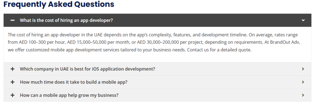
Accordion Style (Expandable Answers)
Accordion-style FAQ pages are clean and user-friendly. Each question is displayed as a clickable item, and when selected, it expands to reveal the answer while keeping other questions collapsed.
This keeps the layout compact, especially on mobile devices, and avoids overwhelming users with too much text at once.
It’s ideal for websites with many FAQs, as it allows users to scan through questions quickly and dive into the details only when needed.
Visually, you can enhance this style with smooth transitions and icons like “+” and “–” to show open or closed states.
Category Tabs or Filters
When your FAQ section covers multiple topics, organizing it into categories using tabs or filters improves navigation and clarity.
Users can click on categories like “Shipping,” “Payments,” or “Returns” to see only relevant questions.
This method is especially helpful for e-commerce, SaaS, and service websites with diverse customer concerns.
It prevents information overload and helps users reach answers faster. You can display the tabs horizontally or as a dropdown filter for mobile.
Combining this with accordion-style answers within each category can further streamline the experience.
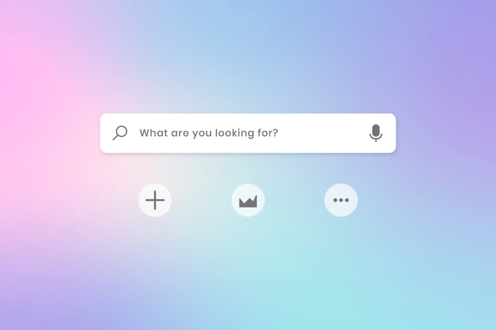
Searchable FAQ Bar
A search bar allows users to type their query and instantly view matching questions and answers.
This is ideal for websites with a large volume of FAQs or users who know what they’re looking for. It eliminates the need to scroll or browse through categories.
Live search results with keyword highlighting and auto-suggestions further enhance the experience. You can integrate analytics to track common queries and refine your content based on actual user behavior.
A searchable FAQ gives a smart, dynamic feel to your help section and reduces support tickets.
Chatbot-Style or Interactive Widget
Try using a chatbot-style widget that offers answers in a conversational format rather than relying on a traditional static FAQ page.
When users click the chatbot icon, it opens a chat-like window where they can type their question or choose from popular topics.
The bot instantly provides answers or suggests related FAQs. This feels more personal and is especially useful on mobile or SaaS platforms. It can also be connected with your live support for seamless handover.
Chatbot widgets offer an engaging, on-demand experience, reducing bounce rates and encouraging users to explore more.
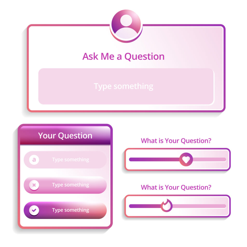
Visual FAQ with Icons or Illustrations
A visual FAQ adds character and enhances understanding by using icons or illustrations alongside each question or category.
It makes your page more engaging and easier to scan, especially for visual learners. Icons help users quickly identify relevant topics without reading each question.
This style works well for creative brands, lifestyle products, or websites that want to convey friendliness and ease.
You can use colored sections, illustrated category banners, or icon-based toggle cards. It’s a great way to balance functionality with visual appeal while keeping the user experience intuitive.
Video/Animated Answers
Instead of plain text answers, embed short videos or animated guides that walk users through solutions.
This is highly effective for technical products, tools, or services that require demonstration.
A 30–60 second video can communicate far more clearly than a long block of text.
You can add captions, visuals, and voiceover for better clarity. Hosting these videos on YouTube or internally also adds SEO value.
Animated or screencast-based FAQs not only help users resolve issues faster but also reduce support requests significantly by showing instead of telling.
Mini FAQ Inside Relevant Pages
Rather than isolating your FAQ on a single page, embed 2–3 relevant FAQs directly on service or product pages.
For example, a product page could show “What’s the return policy?” or “When will it be delivered?” This removes friction and answers doubts at the right moment, increasing conversions.
You can use collapsible panels or hover tooltips to present these FAQs in a non-intrusive way.
This approach feels contextual and thoughtful, ensuring customers don’t need to navigate away just to find basic info.
Sticky Table of Contents (Sidebar)
A sticky sidebar or top navigation that lists all FAQ questions allows users to jump directly to what they need.
Clicking on any item smoothly scrolls the page to the relevant answer. This layout is best for long FAQ pages with 20+ questions.
It improves usability and reduces frustration caused by endless scrolling. You can also highlight the active section as the user scrolls, giving a clear sense of location.
It works well for B2B or knowledge-heavy websites where detailed answers are common.
Toggle Cards with Emojis or Icons
Toggle cards combine interactivity with a playful design. Each question appears as a card with a subtle icon or emoji, adding visual appeal and personality.
When clicked, the card flips, slides, or expands to reveal the answer inside.
This style breaks the monotony of plain lists and is ideal for brands targeting younger audiences or wanting a casual, friendly vibe.
Arrange the cards in a grid layout to make it easier for users to browse through the questions at a glance.
The visual element helps differentiate questions and keeps the overall design clean, modern, and engaging without sacrificing clarity.
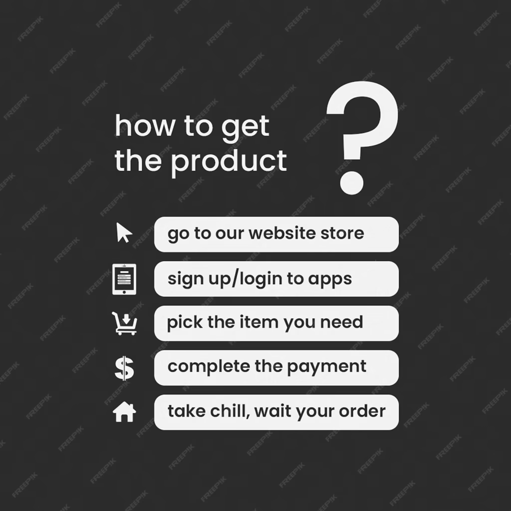
Step-by-Step Flow (Process-Based FAQs)
This layout is perfect for services that follow a clear user journey, such as booking, onboarding, or returns.
Instead of listing all questions together, FAQs are presented in the same order as users experience the process.
For example: “Before You Book,” “During Your Trip,” and “After Service.” This helps users stay oriented and anticipate the next steps.
Adding icons or numbers for each step improves clarity. It’s a great option for travel, edtech, and customer service-oriented platforms that want to guide users through each stage of their journey.
FAQ as a Timeline or Journey
Similar to a step-by-step flow, this design organizes FAQs into a timeline format, showing how questions fit along the customer experience.
This works especially well for multi-stage services like courses, shipping processes, or project timelines.
Each milestone on the timeline (e.g., Sign-up → First Use → Advanced Features) expands to reveal related questions.
The visual layout adds clarity and helps users feel like they’re progressing. It also reassures them by answering concerns they might not have even thought of yet, creating a proactive support experience.
User-Submitted Questions Section
Incorporating real questions from users builds trust and shows your brand listens. You can show a “Top Asked by Users” section or allow visitors to submit questions through a form.
Include features like upvoting or “most helpful” tags to prioritize valuable content.
This adds authenticity and reflects evolving user concerns. It’s especially useful for SaaS, marketplaces, or forums where user interaction drives improvement.
You not only help new visitors but also create community involvement. Over time, it can help shape product decisions and refine your FAQ content strategy.
Inline Popups for FAQs
Instead of redirecting users to an FAQ page, provide micro-FAQs using icons or tooltips within your website’s UI.
For example, next to a price, form field, or policy link, include a small “?” icon that, when clicked, opens a short explanation.
This approach is seamless and ensures users get relevant information without navigating away.
Inline popups are ideal for checkout pages, subscription forms, or pricing tables.
They prevent confusion and reduce bounce rates by handling objections and clarifying doubts exactly when and where they arise.
Dark Mode FAQ Page
Offering a dark mode option for your FAQ section enhances readability for users who prefer low-light browsing.
It’s especially effective for developer platforms, tech products, and mobile-first brands. A toggle button allows users to switch between light and dark themes.
Beyond aesthetics, dark mode reduces eye strain, increases time-on-site, and aligns with modern UI expectations.
You can use high-contrast text, subtle animations, and icon highlights to keep it visually appealing while maintaining usability across devices.
It’s a small feature that adds significant polish and personalization.
Gamified FAQ (Quizzes or Flip Cards)
Gamified FAQs turn support content into an interactive, fun experience.
You can present questions as flip cards where users click to reveal the answer on the back, or use mini quizzes that help guide them toward the correct solution step by step.
This works best for learning platforms, edtech, or youth-oriented brands. It reduces friction and encourages exploration while keeping users entertained.
Gamified elements like progress bars, badges, or correct/incorrect messages can make the FAQ feel like a self-service assistant.
When well-designed, this approach turns boring content into something users want to engage with.
Animated Transitions
Subtle animations during FAQ interactions enhance user experience without being distracting.
For example, when a user clicks on a question, the answer can fade in, slide down, or expand with a smooth motion.
This small design touch makes your page feel modern and refined. Animations also help users visually track what’s happening, especially when navigating complex or lengthy sections.
Ideal for modern UI-focused brands, it’s often combined with accordion, card, or tab-based layouts. The key is to keep transitions fast, fluid, and unobtrusive.
Sticky FAQ Assistant Sidebar
A sticky FAQ sidebar stays visible as users scroll through your website. Clicking it opens a mini FAQ drawer or overlay on the side, allowing users to browse answers without leaving the current page.
This design is particularly helpful for product pages, landing pages, or checkout flows where users may require quick clarification.
The assistant-style layout offers convenience and keeps users engaged without interruptions. You can also integrate search, filters, or live chat within this sidebar for a more powerful support tool.
Effective FAQ Design
Effective FAQ design ensures users can find answers quickly without feeling overwhelmed.
It focuses on clarity, structure, and a smooth browsing experience that supports both mobile and desktop users. It include
- Questions grouped by relevant categories
- Search bar for fast keyword-based navigation
- Expandable/collapsible sections to keep the page tidy
- Visual elements like icons or spacing to improve scanning
- Logical flow from general to specific questions
- Mobile-responsive design for easy on-the-go access
- Minimal distractions to keep the focus on the information
- Call-to-action or contact link for unanswered queries
- Designed to reduce support tickets and build user trust
Who offers expert FAQ page design services?
Brandout offers expert FAQ page design services as part of its custom WordPress website solutions.
Their team focuses on both design and functionality, creating clean, structured FAQ sections that match your brand and help users find answers easily without confusion.
Conclusion:
Now that you have explored multiple ways to design a user-friendly and engaging FAQ page, it’s clear that presentation matters just as much as content.
From collapsible layouts to visual elements and search-friendly structures, each design idea plays a role in improving how users interact with your site.
Choosing the right format depends on your audience and the type of website you are building.
And if you want a professionally built FAQ section that fits seamlessly into your site’s design, getting expert support ensures everything looks clean, works smoothly, and reflects your brand perfectly.
Most Asked Questions about the FAQ Page:
How should an FAQ page UI be designed for mobile devices?
Use accordion-style questions to save space and ensure easy tapping. Keep fonts readable, group questions by category if needed, and add a search bar for quick access.
How do I design an FAQ page in Figma?
Begin by creating a structured design using Figma’s auto layout feature and reusable components for consistency and easy adjustments.
Use variants for interactive accordion effects and maintain consistent spacing, fonts, and icons to match your brand.
What is an FAQ page design template?
It’s a pre-structured layout that organizes FAQs neatly, often including features like accordions or tabs.
Templates help speed up design and ensure consistency across pages.