
A responsive website is not a bonus, it’s expected. With over 61.5% of global web traffic now coming from mobile devices, people expect a site to work smoothly on phones, tablets, and desktops.
A responsive website adjusts its layout, images, and features to fit any screen size.
This improves how users experience your site, helps your search rankings (Google favors mobile-friendly pages), and can even lead to better results ,whether that’s more clicks, sign-ups, or sales.
In this guide, you’ll learn:
- Core principles of responsive web design (RWD)
- Step-by-step techniques to make any website responsive
- Free tools to test responsiveness
- Common mistakes to avoid
What Is Responsive Web Design?
Responsive web design (RWD) ensures a website adapts smoothly to different screen sizes and devices. Unlike adaptive design (which uses fixed layouts for specific devices), RWD uses fluid grids, flexible images, and CSS media queries to create a seamless experience.
Core Principles of RWD
Fluid Grids – Use relative units (%, vw) instead of fixed pixels.
Flexible Images – Scale images proportionally with max-width: 100%.
Media Queries – Apply CSS rules based on screen size.
Responsive vs. Adaptive vs. Mobile-First Design
| Approach | Description |
| Responsive | Fluid layouts that adjust dynamically. |
| Adaptive | Predefined layouts for specific devices. |
| Mobile-First | Design for mobile first, then scale up. |
Best Practice: Use mobile-first design for better performance and UX.
Steps to Make a Website Responsive
Making a website responsive involves more than just resizing elements, it’s about designing with flexibility from the start.
The goal is to create a layout that adjusts smoothly across different screen sizes without breaking the user experience.
Below are key steps that help any website work well on all devices.
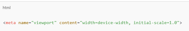
Set the Viewport Meta Tag
The viewport meta tag is a small but essential part of responsive web design. It tells the browser how to scale and display content based on the device’s screen size.
Without it, websites often appear zoomed out or poorly scaled on mobile devices, forcing users to pinch and zoom.
Adding this tag ensures your layout adjusts to fit the screen properly. The most common setup looks like this:
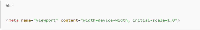
This line ensures your site renders correctly across smartphones, tablets, and desktops, improving both usability and overall user experience.
Use Fluid Grid Layouts
Using fluid grid layouts is key to building a responsive website. Unlike fixed layouts that rely on set pixel values, fluid grids use relative units like percentages or vw (viewport width) to size elements.
This allows your layout to adjust automatically as the screen size changes. CSS tools like Flexbox and Grid are ideal for creating flexible structures. For example, with Flexbox:
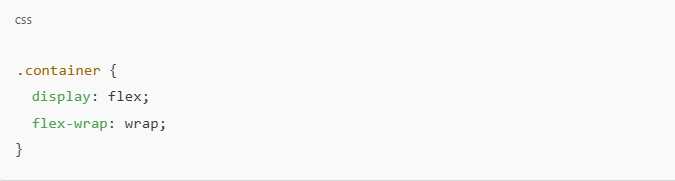
And with CSS Grid:
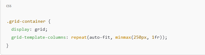
Fluid grids create layouts that scale smoothly across devices.
Make Images & Media Responsive
To ensure your visuals look good on all devices, it’s important to make images and media elements responsive.
This keeps content from overflowing or appearing distorted on smaller screens.
Flexible Images
Use CSS to make images scale within their containers. This prevents layout breaking on mobile.
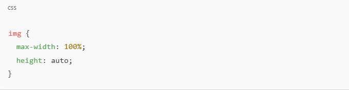
This ensures the image adjusts to the container’s width while keeping its aspect ratio.
Responsive Videos (Using Aspect Ratio)
Wrap videos in a container that maintains the correct ratio.

This technique keeps videos from overflowing on mobile screens.
Adaptive Images with srcset
Use srcset to serve different image sizes depending on screen width and resolution.
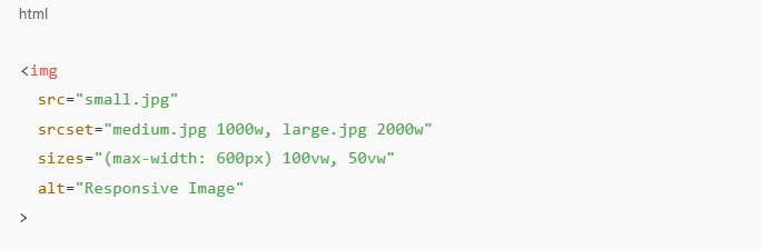
This improves loading speed and visual quality, especially on high-resolution or large displays.
Apply Media Queries for Breakpoints
Media queries allow you to apply different styles based on screen size, making them essential for responsive design.
They help you tailor layouts, font sizes, and visibility for various devices like mobiles, tablets, and desktops. For example:
Media queries apply different CSS rules based on screen size.
Common Breakpoints (2025 Standards)
| Device | Breakpoint |
| Mobile | @media (max-width: 576px) |
| Tablet | @media (max-width: 768px) |
| Laptop | @media (max-width: 992px) |
| Desktop | @media (min-width: 1200px) |
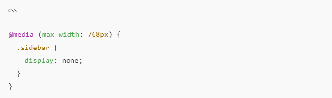
This hides the sidebar on smaller screens. Breakpoints typically target common device widths, which starts with a basic layout and adds enhancements as screen size increases. This keeps designs clean and efficient.
Optimize Typography for Readability
Optimizing typography ensures your content remains readable and accessible across all devices.
Use relative units like rem, em, or vw instead of fixed px values, so text scales naturally with screen size.
Maintain a comfortable line height (around 1.5) to improve legibility, especially on smaller screens.
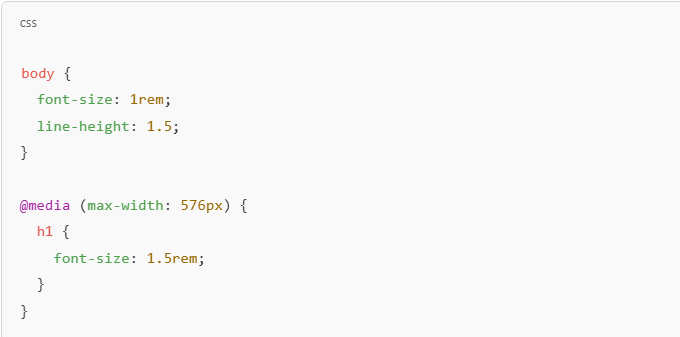
Choose web-safe fonts and maintain enough contrast between text and background.
Good typography improves user experience, keeps visitors engaged, and makes your site feel polished.
Create Touch-Friendly Navigation
Creating touch-friendly navigation is crucial for mobile users who interact with your site via taps.
To ensure usability, make buttons and links large enough for comfortable interaction, aim for a minimum size of 48x48px.
Use hamburger menus or collapsible navigation on smaller screens to save space.
For touch targets, ensure adequate spacing between clickable elements to prevent accidental clicks.
Example:
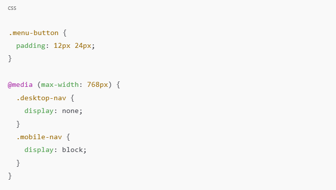
This approach ensures easy navigation on all devices and enhances the overall user experience.
Test Responsiveness on Real Devices
Testing responsiveness on real devices is essential to ensure your website works as intended across various screen sizes and platforms.
While browser developer tools and emulators are helpful, they can’t always replicate the real user experience.
Testing on actual devices (smartphones, tablets, desktops) helps you identify issues such as touch target sizes, loading times, and how elements scale in real-world usage.
Free Responsive Design Checker Tools
| Tool | Link |
| Google Mobile-Friendly Test | Google Test |
| Responsinator | Responsinator |
| Am I Responsive? | Am I Responsive |
| BrowserStack (Free Trial) | BrowserStack |
| Screenfly | Screenfly |
Best Practice: Always test on physical devices (iOS and Android) for the most accurate results.
Advanced Responsive Design Techniques
Once your site covers the basics of responsiveness, you can explore advanced methods to improve performance, flexibility, and user experience across devices.
Conditional Loading
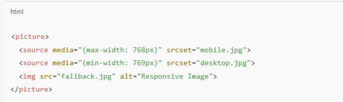
Load different resources based on device size to improve speed and performance.
For example, serve smaller images on mobile and higher resolution ones on desktop.
Use the <picture> element for art direction:
Use CSS Frameworks
Bootstrap (getbootstrap.com)
Tailwind CSS (tailwindcss.com)
These tools save time and help maintain consistency across devices.
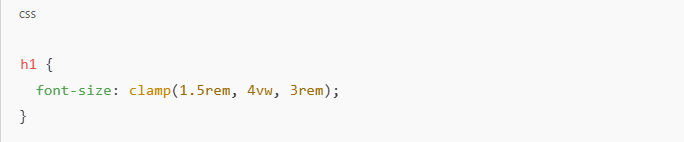
Responsive Typography with Clamp()
Use the clamp() function for font sizes that adapt fluidly.
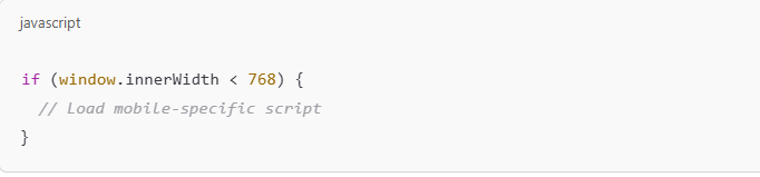
JavaScript Enhancements
Detects screen size or orientation changes to dynamically adjust content or load scripts.
These techniques make your responsive design more dynamic, efficient, and tailored to users across every device.
Common Responsive Design Mistakes
Even well-intentioned responsive designs can run into problems if key principles are overlooked.
Here are some common mistakes to watch out for:
Ignoring Touch Targets: Small buttons or tightly spaced links make navigation frustrating on mobile.
Ensure touch areas are at least 48x48px with enough padding between elements.
Using Fixed Units: Relying on px for widths, fonts, or spacing can break layouts on smaller screens.
Use relative units like %, em, rem, or vw for flexibility.
Not Testing on Real Devices: Simulators can’t fully replicate device behavior.
Always test on actual phones and tablets to spot layout or interaction issues.
Hiding Essential Content: Avoid completely hiding important information on mobile versions.
Instead, reorganize content or use collapsible sections to maintain accessibility.
Overcomplicating Layouts: Too many nested elements or complex media queries can make maintenance difficult.
Keep layouts clean and scalable.
Avoiding these mistakes helps you create a smoother, more reliable experience for every user, regardless of device.
Final thoughts
Making a website responsive isn’t just about adapting to screen sizes, it’s about creating a consistent, accessible, and enjoyable experience for every visitor.
From setting the viewport meta tag and using flexible grids to optimizing media and typography, each step contributes to a design that works smoothly across devices.
Responsive design also supports better SEO, faster load times, and higher engagement.
Start with a mobile-first approach, test thoroughly on real devices, and avoid common mistakes to ensure your site stays functional and future-ready.
With the right techniques in place, your website will feel seamless, no matter how or where it’s viewed.
Action Step: Test your site now using Google’s Mobile-Friendly Test!
Need a Responsive Site? BrandOut Builds It Right.
A responsive website isn’t just a trend, it’s a must. At BrandOut, our web development service makes your site look and function great on every screen from mobile to desktop. No broken layouts, no slow loads.
Just a smooth, user-friendly experience that keeps visitors engaged and coming back. Let’s build it right.
Most Asked Questions
How do I make my website fully responsive?
To make your website fully responsive, use a combination of a viewport meta tag, flexible grid layouts (Flexbox or Grid), responsive images, and CSS media queries.
Test your site on real devices to ensure it adapts well across all screen sizes.
How to make websites responsive using CSS?
Use relative units like %, rem, and vw for layout and typography, apply media queries for different breakpoints, and use Flexbox or CSS Grid for structure.
This ensures elements adjust automatically based on screen size.
How to make a website responsive using HTML?
In HTML, start with the viewport meta tag:
Then structure content using semantic elements and responsive-friendly containers that work with CSS.
Which is an example of a responsive web page?
A responsive web page is one that adjusts layout, images, and font sizes automatically across devices.
Examples include websites like apple.com or bbc.com, which look great on both mobile and desktop.
How to make a website responsive for all devices automatically?
Use a mobile-first CSS approach with flexible layouts, responsive media, and well-defined breakpoints using media queries.
Combine these with fluid typography and test thoroughly to make your site adjust automatically across all devices.