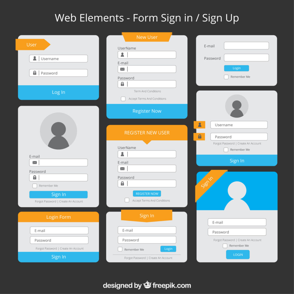
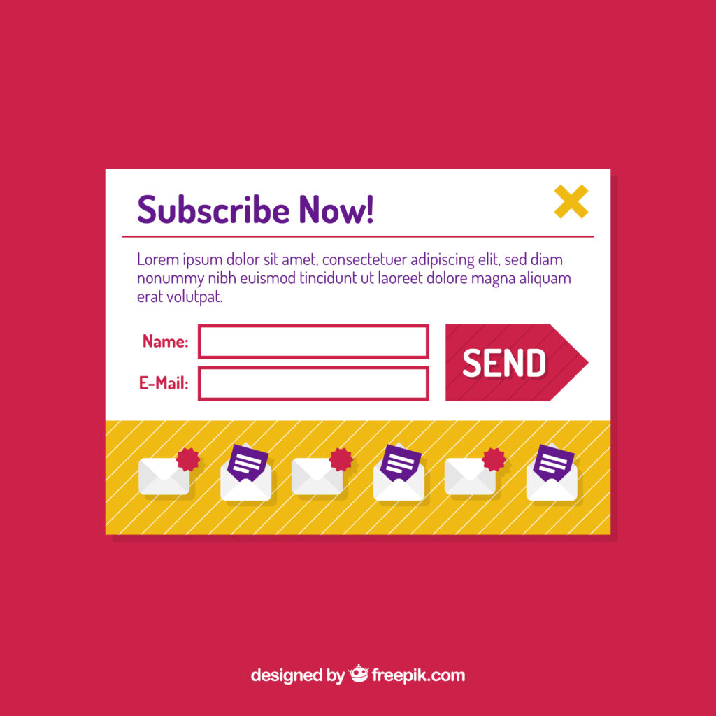
Subscription-based businesses rely on smooth and simple sign-up forms to attract customers. When the process is confusing or lengthy, users drop off.
A well-designed form, on the other hand, fosters trust and ensures a positive first interaction with your service.
Good UX is not about adding flashy elements but about reducing friction and guiding users to complete their subscription with confidence.
What are subscription sign-up forms?
Subscription sign-up forms serve as digital entry points, where users provide their personal and payment details to access a recurring service.
These forms typically include fields such as name, email, password, and billing information.
The goal is to make the process quick, secure, and transparent so that users complete the subscription without hesitation.
For example, a streaming service offering a free trial must collect only essential information upfront to avoid overwhelming new customers.
Effective UX Design Tips for Subscription Sign-Up Forms
Below are effective UX design tips for subscription sign-up forms that make the process smooth, clear, and trustworthy.
These practical guidelines help reduce drop-offs and encourage more users to complete their subscriptions.
1. Keep the Form Short
Asking for too much information upfront usually discourages users from completing a subscription.
A shorter form reduces effort and makes the process feel lighter, which is especially important when dealing with first-time visitors.
Focus on collecting only essential details, such as the user’s name, email address, and payment information.
Fields like phone number, location, or full address should only appear if the service absolutely requires them.
Additional questions about preferences or demographics can be asked later once users are comfortable.
A concise form communicates respect for the user’s time and increases the chance of conversion.
Whenever possible, use autofill support so repetitive typing is minimized. Simplicity not only improves speed but also leaves users with the impression that signing up is a hassle-free experience.

2. Use Clear Labels and Instructions
Labels and instructions play a critical role in reducing errors and keeping users confident throughout the process.
Each field must have a descriptive and unambiguous label.
For example, instead of writing only “Name,” specify “Full Name” so users know exactly what to enter.
When certain requirements exist, such as password complexity or date formats, display them right next to the field.
Inline instructions prevent frustration because users don’t need to guess what the form expects.
Ambiguous language or hidden rules often result in failed submissions, which increases abandonment rates.
The goal is to create a transparent process where people feel guided rather than tested.
Even small details like placeholder text, error messages, and character limits should be written clearly.
Users should always feel like they are filling out something straightforward instead of decoding an unclear set of requirements.
3. Show Progress with Multi-Step Forms
When subscription sign-ups involve several actions, such as selecting a plan, entering personal details, and confirming payment, breaking the process into multiple steps is more user-friendly.
Instead of presenting everything in one long scroll, divide the form into logical stages with a clear progress indicator.
A progress bar or numbered steps reassures users that the process is structured and finite.
This reduces the sense of overwhelm that often comes with long, unbroken forms.
Each step should be dedicated to a single task, such as choosing a plan or entering billing information, so users stay focused.
Consistent navigation options like “Next” and “Back” allow people to control their pace without losing entered data.
Clear visual hierarchy in multi-step layouts helps prevent errors and provides clarity.
Users are more likely to complete forms when they know how many steps remain and can anticipate what comes next.

4. Provide Social Sign-Up Options
Reducing the effort required to create an account often results in more completed sign-ups.
Social sign-up options such as Google, Apple, or Facebook give users the ability to register with a single tap instead of typing multiple details.
These integrations are convenient because they save time and reduce the chance of errors in email or password entries.
Offering this choice is especially valuable on mobile devices, where typing can feel cumbersome.
However, not every user prefers linking accounts, so always provide a standard email sign-up option as well.
Balancing convenience and flexibility ensures inclusivity. Social sign-ups also help users quickly access the platform on different devices without remembering another password.
Placement of these buttons should be prominent but not forceful.
Giving users control over how they sign up strengthens trust while keeping the form fast, intuitive, and tailored to individual preferences.
5. Use Inline Validation
Form errors frustrate users most when they appear only after submission. Inline validation solves this issue by checking each field in real time.
When a user enters an invalid email, a mismatched password, or an incorrectly formatted phone number, the form should display immediate feedback.
This approach reduces repetitive corrections and helps users feel more confident as they progress.
Inline validation also communicates that the system is responsive and attentive, creating a smoother experience.
Error messages should be specific, explaining exactly what needs correction, instead of vague warnings like “Invalid input.” Positive indicators, such as a green checkmark when data is entered correctly, can also reassure users.
Correct use of inline validation keeps people on track and prevents them from abandoning the process due to multiple failed attempts.
It not only minimizes mistakes but also increases trust in the reliability of the form itself.

6. Be Transparent About Pricing
Unexpected costs are a major reason people abandon subscription sign-ups.
Being upfront about pricing, renewal dates, and trial conditions removes uncertainty and prevents frustration later.
Display the plan price clearly next to each option, including whether the payment is monthly, yearly, or tied to specific features.
If a free trial is offered, explain exactly when charges will begin and how cancellations work.
Any additional fees, such as taxes or service charges, should also be visible before users proceed to payment.
Transparency helps users feel in control of their decisions and avoids the sense of being misled.
Clarity in pricing not only improves completion rates but also reduces cancellations after sign-up because users know what to expect.
Trust is vital when dealing with recurring payments, and clear cost communication is one of the simplest ways to build that trust early.
7. Optimize for Mobile
A significant portion of users will access subscription forms through their smartphones, which means mobile optimization cannot be ignored.
Mobile-friendly forms require larger touch targets, responsive layouts, and minimal typing.
Features like auto-capitalization for names, numeric keyboards for credit card fields, and autofill support greatly improve speed and comfort.
Long text fields or excessive scrolling can feel frustrating on smaller screens, so breaking content into manageable sections is essential.
Elements should also be spaced to prevent accidental taps, particularly for action buttons like “Submit” or “Next.”
Testing forms across different devices and browsers ensures consistency.
Mobile optimization goes beyond shrinking a desktop form; it involves designing with the user’s hand, thumb reach, and limited attention span in mind.
A seamless mobile experience gives users confidence to subscribe without switching to a computer, which directly improves conversions.

8. Add Visual Hierarchy
A form without a clear structure often feels confusing and slow to complete.
Visual hierarchy solves this problem by guiding the user’s attention through spacing, typography, and contrast.
Important sections, such as plan selection or payment details, should stand out clearly from supporting information.
Call-to-action buttons like “Subscribe Now” need distinct styling so they are easy to locate without scanning too much.
Group related fields together and separate them with white space to createa logical flow.
Headings, labels, and input boxes should follow a consistent style that avoids clutter.
Highlight error messages or required fields with subtle but noticeable cues so users understand what needs attention.
When the form appears organized, people naturally complete it more quickly with fewer mistakes.
A strong visual hierarchy not only improves usability but also communicates professionalism, making the service appear trustworthy and reliable from the very first interaction.
9. Offer a Guest Checkout or Trial
Commitment anxiety is common when users encounter subscription forms that require full payment information upfront.
Offering a guest checkout or trial lowers the barrier and gives people the opportunity to test the service before committing financially.
For example, allowing users to sign up with only an email address for a limited trial period builds familiarity with the product.
Once they experience the value, they are more likely to provide billing information later.
A guest flow should still be designed with clarity, showing how long access lasts and what limitations exist.
Transparency ensures the experience feels honest rather than manipulative.
By reducing the initial risk, guest checkout or trial options can convert hesitant visitors into long-term subscribers.
This approach creates a sense of fairness where users feel empowered to choose rather than pressured to pay immediately.

10. Reassure with Trust Signals
Subscriptions often involve recurring payments, which means users are cautious about where they enter sensitive information.
Trust signals help ease this concern and encourage sign-ups. Displaying security badges, SSL certificates, or familiar payment provider logos communicates that the platform follows industry standards.
Privacy statements explaining how user data is handled can further reduce hesitation.
Social proof such as testimonials, ratings, or even the number of current subscribers also strengthens credibility.
Placement of these trust elements matters; they should be visible near the payment section or submit button, where users might pause before finalizing.
The tone of reassurance should feel genuine and not exaggerated, as overuse of badges can create suspicion.
When users feel their data is safe and the company is reliable, they are more likely to complete the subscription confidently, knowing their information is being handled responsibly.
Need expert help with your subscription form design?
Brandout provides UX design and web development services to create subscription sign-up forms that are simple, clear, and reliable.
Our approach ensures forms are easy to complete, mobile-friendly, and designed with a smooth flow that reduces drop-offs.
Every form is built to match your brand style while keeping the process professional and user-focused.
With Brandout, businesses get subscription forms that work seamlessly and build trust from the first interaction.
Final Thoughts
Subscription sign-up forms act as the first commitment point between a business and its potential customer.
A thoughtful design that prioritizes simplicity, clarity, and trust creates a smoother path to conversion.
Every detail, from the number of fields to how errors are displayed, influences whether users finish the process or abandon it.
Businesses that design forms with the user’s perspective in mind set themselves apart, creating not just higher completion rates but also stronger long-term relationships.
Most Asked Questions:
What common mistakes should be avoided in subscription sign-up forms?
Asking for too much information upfront, unclear error messages, and cluttered layouts push users away.
Keeping the form simple, guided, and error-free helps maintain focus. Avoiding these mistakes directly improves completion rates.
How can visuals improve the user experience of subscription forms?
Visual cues like icons, progress bars, and clean spacing guide users naturally through the process.
They reduce confusion by showing clear steps and groupings. A visually balanced form feels easier and quicker to complete.
Do personalized messages make a difference in subscription sign-ups?
Personalized text, such as a warm welcome or short reassurance, creates a friendly tone.
It helps reduce hesitation when users share personal details. Small touches often increase comfort and trust in the process.
Why is testing important for subscription form design?
Testing highlights hidden issues such as unclear labels, weak validation, or mobile glitches. Regular checks allow quick fixes before they hurt conversions.
A well-tested form ensures smoother sign-ups and higher user confidence.


