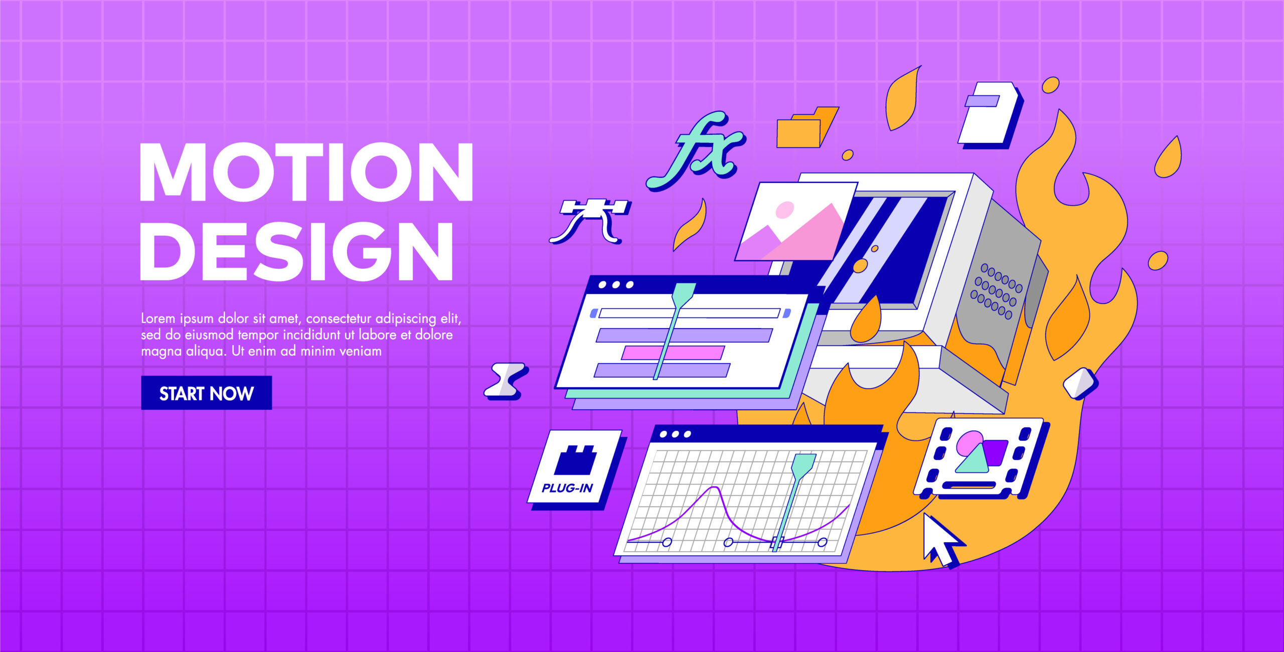
Motion design in user interfaces is more than just adding animations for visual appeal.
It plays a crucial role in improving user experience, providing visual feedback, and guiding attention.
When implemented properly, motion creates a sense of connection between user actions and system responses.
Designers use these principles to create intuitive interactions that feel natural and purposeful.
This article examines the fundamental principles of motion design for UI, presenting them in ten clear points with practical applications for digital interfaces.
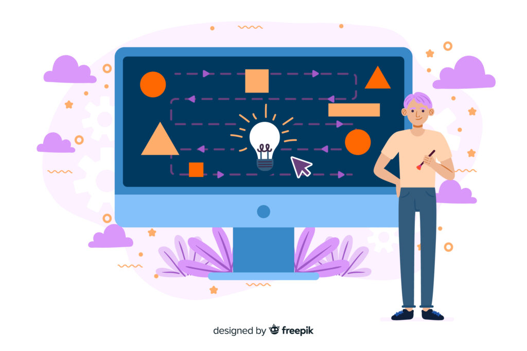
What is motion design in UI?
Motion design in UI is the intentional application of animations, transitions, and movement in digital interfaces to make them more user-friendly and deliver a better overall experience.
It’s not about adding decorative effects but about creating meaningful interactions that guide users, provide feedback, and make navigation intuitive.
For instance, when a user presses a button, a quick ripple or a subtle size change signals that the action has been recognized.
Similarly, smooth page transitions maintain continuity between screens, reducing confusion and making the flow clear.
When implemented correctly, motion design makes interfaces feel natural, responsive, and engaging while supporting the functional goals of the product.
Key Motion Design Principles Every UI Designer Must Know
Here are some key motion design principles every UI designer must know.
These guidelines ensure smooth interactions, clear feedback, and an engaging user experience.
1. Clarity in Every Interaction
Clarity is the foundation of effective motion design. Every animation must serve a purpose that enhances understanding rather than confusing users.
For example, when a user taps a button, the motion should indicate that the action has been registered.
Animations like subtle scaling or color changes make interactions feel responsive and guide users without overwhelming them.
Clarity helps avoid ambiguity and ensures that users understand what is happening on the screen.
A clear motion creates trust in the interface and eliminates frustration that often arises from unexpected behaviors.
2. Continuity Between UI States
Consistency and continuity maintain the logical flow of an interface.
Smooth transitions between screens or states help users understand where elements come from and where they are going.
Abrupt jumps can feel unnatural and cause disorientation. Motion should show the relationship between elements, such as a card expanding into a detailed view.
This makes the navigation experience intuitive and reinforces the concept of spatial hierarchy.
When continuity is applied correctly, it reduces cognitive load and creates an experience that feels both familiar and predictable.
3. Feedback for User Actions
Feedback plays a vital role in interaction design, and motion serves as an effective way to deliver it. Users anticipate a visible reaction whenever they act.
Motion communicates success, failure, or progress effectively.
A typical example is the ripple effect in material design, which immediately signals that a tap has been registered.
Loading indicators, check marks, and progress animations are other forms of feedback.
Without motion-based feedback, users may feel uncertain about whether their actions were processed.
Implementing meaningful feedback keeps the interaction loop complete and improves usability significantly.
4. Hierarchy and Focus Through Motion
Motion can guide user attention toward important elements in a design.
It helps establish hierarchy by making primary actions more noticeable than secondary ones.
For instance, a call-to-action button can slightly animate when the page loads, drawing attention without being intrusive.
Similarly, when a new notification appears, motion ensures it stands out without distracting users from their current task.
Designers should balance focus and subtlety, as excessive or exaggerated animations can reduce usability.
Properly applied motion hierarchy leads to smoother navigation and better conversion rates.

5. Consistency Across the Interface
Consistency in motion design builds familiarity and trust. When users experience similar animation patterns across different sections, they understand the behavior of the interface better.
Using consistent timing, easing curves, and movement styles ensures that the design feels cohesive.
For example, if one modal window slides in from the bottom, all modals should behave the same way.
Inconsistent animations create confusion and break the flow of interaction.
A well-defined motion system or design guideline helps maintain consistency across the entire digital product, ensuring a seamless experience.
6. Speed and Timing Matter
The timing of motion is critical in user interface design.
If animations run too slowly, the interface feels sluggish, and if they move too quickly, users might miss them entirely.
Ideally, UI animations range between 200 ms and 400 ms, depending on the complexity of the action.
Smooth timing ensures that users perceive changes without feeling delayed.
Designers should also consider acceleration and deceleration within these time frames for a natural effect.
Proper speed improves usability, supports clarity, and keeps the interaction process efficient and satisfying.
7. Natural Easing for Realistic Motion
Natural motion follows real-world physics, which makes animations feel intuitive and believable.
Using easing curves instead of linear motion adds depth and character to animations.
For instance, an object should accelerate at the start and decelerate before coming to rest, mimicking real movement.
This principle creates a sense of realism and comfort for users, reducing the mechanical feel of digital interactions.
When applied correctly, easing contributes to an interface that feels lively yet controlled, improving both aesthetics and functionality without overwhelming the user.
8. Purposeful Animations Only
Every animation should serve a specific purpose. Motion should never exist just to look attractive; it must provide clarity, feedback, or enhance usability.
Unnecessary animations slow down the interface and can frustrate users, especially on mobile devices where performance is critical.
Designers should evaluate whether an animation adds value to the user experience before implementing it.
Purposeful motion reduces clutter, speeds up interactions, and maintains user focus on the task at hand.
A clean, efficient design with meaningful animations always outperforms one overloaded with visual effects.
9. Maintaining Spatial Relationships
Motion helps users understand the spatial relationship between different elements in the interface.
For instance, when moving from a list to a detailed screen, the chosen item can smoothly transition and enlarge into the full view.
This transition shows continuity and reinforces context. Without such animations, users might feel disconnected from their previous action.
Maintaining spatial relationships through motion provides a sense of structure and flow, making complex navigation systems easier to understand.
It reduces confusion and enhances the user experience by connecting different parts of the interface visually.
10. Adding Delight Without Distraction
Delightful micro-interactions can make an interface memorable, but they should never distract from usability.
Small animations, like a heart icon bouncing when tapped or a progress bar glowing upon completion, create emotional engagement.
These subtle details give users a sense of satisfaction and humanize the interface.
However, designers must avoid overdoing it, as too many playful animations can feel unprofessional or slow down interactions.
Striking the right balance ensures that users enjoy the experience without sacrificing efficiency or clarity in completing their tasks.
How can Brandout integrate these principles into UI design services to deliver high-performing digital experiences?
Brandout applies these principles through custom UI/UX design, adding meaningful animations and micro-interactions for smooth user journeys.
Our responsive designs and front-end development ensure intuitive, performance-driven digital experiences.
Every project focuses on motion that improves usability while aligning with brand identity.
Conclusion:
Motion design transforms interfaces into meaningful experiences by guiding users smoothly through every interaction.
When principles like clarity, continuity, and consistency are applied with purpose, animations go beyond decoration and become functional.
Well-crafted motion improves usability, communicates feedback, and adds subtle delight, resulting in interfaces that feel natural, intuitive, and truly user-friendly.
FAQs
Why is motion important in UI design?
Motion provides instant feedback, clarifies user actions, and makes navigation smooth. It creates a natural flow that improves usability and overall engagement.
What is the ideal duration for UI animations?
Most animations work best between 200 ms and 400 ms. This timing is fast enough to keep the interface responsive yet slow enough for users to notice.
Should every UI element have motion?
Not every element needs animation. Motion should be added only when it improves usability, provides feedback, or guides attention.
How do I keep motion consistent across an app?
Create a motion design system with uniform timing, easing curves, and animation styles. Consistency builds familiarity and avoids user confusion.