Modern web design trends focus on more than just looks. Websites are now built to feel interactive, human, and meaningful.
From motion and texture to simple layouts and smart AI use, every element guides users and reflects real brand identity.
These trends are shaped by changing habits, faster tech, and new design tools. This article explores the key ideas of Modern Web Design Trends in 2025.
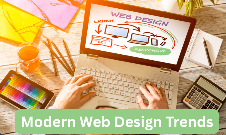
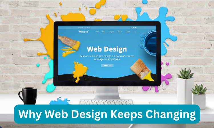
Why Web Design Keeps Changing
Every year, the way people use websites changes. New devices, screen sizes, and browsing habits push designers to think differently.
Web design is not just about trends; it is about responding to how users behave and what they expect.
Modern internet users expect speed, simplicity, and creativity in one place. As websites have evolved into complete digital experiences, design now needs to be flexible, meaningful, and focused on the user.
Interactive layouts, smarter visuals, and emotionally responsive content are becoming common. What worked five years ago may now feel outdated.
This constant change is what drives designers to innovate. When users begin to scroll less, tap more, or use voice instead of typing, the entire layout and structure of a website has to adjust.
This is why modern web design stays in motion and never stands still.
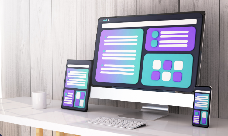
Modern Web Design Trends for 2025
Here are all the modern trends that are making websites feel fresh, interactive, and more human in 2025.
From creative typography choices to immersive visuals, each trend is shaping how people experience the web today.
Bold and Experimental Typography
Typography has taken center stage on many websites. It is no longer just about readability; now it is about expression.
Designers are using large, thick fonts, custom typefaces, and broken layouts to grab attention instantly. Instead of using images or videos first, some websites lead with bold text.
This style speaks loudly and makes visitors pause. Letter spacing, playful arrangements, and bright color combinations make typography more than just words; it becomes the visual.
These experimental choices work especially well for brands that want to stand out and create a strong identity.
Even minimalist websites are embracing bold fonts to communicate more with less. As long as the message stays clear, bold typography can drive both interest and engagement.
Dark Mode Design
Dark mode has grown from a simple aesthetic choice to a preferred style for many users. It is easier on the eyes, especially in low-light settings, and it offers a sleek, modern feel.
Designers are now building entire layouts around dark themes. It creates a strong contrast with text and bright elements, which helps highlight content without overwhelming the screen.
This design also saves battery on OLED devices, which users appreciate. But it is not just about function; dark mode brings a sense of depth and elegance.
Websites with a luxury or tech focus often use this trend to convey professionalism and calm. When paired with minimal design, it gives users a focused and clean experience without distractions.
3D and Immersive Elements
Adding depth through 3D visuals is now easier than ever, thanks to improved browser support and faster internet.
Websites include 3D objects, scroll-triggered animations, and layered content to create an immersive feel.
These elements allow users to interact visually without needing to click too much.
Product demos, brand stories, and portfolios all benefit from 3D environments that guide the visitor’s attention naturally.
This trend is not just about looking modern; it helps explain complex ideas in simple, visual ways.
With the rise of AR and VR, web design is stepping into more immersive territory, and 3D design is a clear bridge to that future.
Neumorphism (Soft UI)
Neumorphism mixes realism with simplicity. It gives UI elements like buttons, cards, and inputs a soft, almost physical look.
With gentle shadows and smooth highlights, these elements appear to be slightly raised or pressed into the screen.
This trend creates a calm, tactile experience that feels natural to the touch. While some say it lacks accessibility if overused, when applied with balance, neumorphism offers a fresh take on familiar components.
It is especially popular in mobile UI and minimalist websites. This soft UI approach gives users a sense of depth and clarity without adding too much noise or distraction.
Micro Interactions That Make You Stay
Little animations and responses can change how a website feels. Micro interactions are the small touches like a button ripple, icon bounce, or menu that responds with a click.
These tiny details guide the user, show feedback, and make navigation feel smoother.
When done well, they do not distract; they reassure. Users know their action worked, they feel connected to the site, and they are more likely to stay longer.
These touches also add personality. A website with thoughtful micro interactions feels crafted rather than mass-produced.
It shows care, and users often remember that feeling more than the content itself.
Kinetic Typography and Animated Text
Words that move, stretch, flicker, or slide create movement without clutter. Kinetic typography adds life to simple text, making headers and messages more dynamic.
This trend is often used in hero sections or intro screens where first impressions matter. Designers use animations to control attention, guiding the reader’s eye from one part of the screen to another.
It also helps deliver emotion or tone without needing visuals. A bold word that gently expands or moves sideways can say more than a static sentence.
This technique makes the reading experience feel alive and part of the overall interaction.
Gamified Design and Drag Interactions
Websites are now borrowing ideas from video games. Drag-and-drop features, progress bars, badges, and point systems are showing up in many modern designs.
These elements give users a reason to interact more deeply. Drag interactions, in particular, feel personal and tactile.
Instead of clicking through, users explore, discover, and play. It turns a simple visit into a mini journey.
Gamified elements also help brands keep users engaged for longer, especially in portfolios, onboarding flows, or product demos.
They are fun but also functional; they give users control and a sense of achievement as they move through the site.

Emotional Design and Storytelling
Websites that trigger emotions are easier to remember. Designers are now weaving stories into layouts, using visual timelines, scroll-driven narratives, and mood-focused visuals.
This emotional design helps users connect, not just click. It is more than just photos and quotes; it is about choosing colors, typography, and movement that align with a feeling.
Brands that focus on storytelling often gain trust faster. Visitors do not just learn about a product; they understand the reason behind it.
This shift toward human-focused design makes sites feel more real, thoughtful, and less like sales pitches.
Abstract, Organic, and Geometric Shapes
Sharp lines are no longer the only way to structure a page. Organic shapes, blobs, waves, and curves give websites a softer and more welcoming tone.
Geometric patterns add structure without becoming too rigid. These design elements break the old grid system and allow for creative flow.
They help guide the eye, create separation, and add movement without using too much animation.
Abstract designs work well for brands that want to appear creative, flexible, or future-ready. When used with space and color balance, these shapes enhance design without adding confusion.
Gradients and Color Transitions
Flat colors are giving way to smooth gradients and color blends. Designers are using multi-tone backgrounds, animated transitions, and subtle shifts in hue to add depth.
These effects make a site feel modern, without needing extra graphics. Gradients help blend sections, direct attention, and set a mood.
From soft pastels to vibrant neons, the color choices often define a brand’s feel. Some websites even use live color changes as you scroll, keeping the experience fresh.
These flowing visuals are light but effective; they bring warmth and richness that flat colors sometimes lack.
Typography and Color Scheme Trends
In 2025, typography and color schemes are becoming more expressive. Designers are mixing fonts, using asymmetrical layouts, and choosing contrast-heavy pairings to guide attention.
Instead of traditional serif or sans-serif decisions, many are going for playful, handwritten, or quirky fonts.
The goal is to match the tone of the brand and make text part of the visual identity. Color palettes are becoming bolder, yet more thoughtful.
Warm earth tones, digital pastels, and bold blacks are showing up in ways that feel modern without being flashy. Together, type and color now carry more meaning than ever.
Sustainability and Eco-Friendly Design
Green design is more than just a color choice. It is a mindset. Lightweight websites that use fewer resources, simple coding, and low-energy visuals are part of this movement.
Designers are reducing animation overload, cutting down on auto-playing media, and choosing sustainable hosting.
This trend shows that the brand cares not just about users, but also the environment.
Clean layouts, subtle animations, and energy-efficient images create fast-loading, user-friendly websites.
It is about doing more with less, while still delivering a strong message. Visitors appreciate brands that consider the bigger picture, and eco-friendly design reflects that value.
Microcopy and Conversational UI
Small bits of text can shape the entire user experience. Microcopy: those tiny lines on buttons, tooltips, and forms make websites feel friendly and easy to use.
Instead of robotic language, designers are writing in natural, casual tones. This helps reduce friction and makes actions clear.
Paired with conversational UI, like chatbots or guided forms, websites now talk to users instead of just showing options.
It feels more like a helpful assistant than a silent page. These changes improve trust, reduce confusion, and help users move forward without hesitation.
Experimental Navigation and Broken Grids
Navigation is no longer just at the top of a page. Designers are experimenting with full-screen menus, floating buttons, and hidden scroll paths.
This opens new ways to guide users through content. Broken grid layouts support this creative direction.
Instead of columns and rows, elements are placed based on rhythm, motion, or storytelling. It gives websites an editorial, expressive feel.
These approaches work well for brands that want to feel bold and modern. While usability should never suffer, thoughtful experimentation in layout and navigation can make a site memorable.
Emphasis on Product Photography
Photos are doing more than showing a product; they are telling its story. High-quality, styled photography has become a central piece of design, especially for e-commerce.
Clean backdrops, natural lighting, and human moments help connect products with emotions.
Users do not just see a product; they feel how it fits into their lives. Full-width images, zoom effects, and scroll-based reveals make the experience richer.
Brands that invest in unique, intentional photography often stand apart. It builds trust and adds depth without needing too much explanation.
Custom Illustrations and Animations
Stock images are being replaced with custom artwork. Illustrations and hand-drawn visuals make websites feel unique and personal.
When animated slightly like a wink, a move, or a soft bounce, they grab attention without overwhelming.
Custom visuals help explain complex ideas in friendly ways. They also support brand identity by adding recognizable, creative touches.
This trend shows care and effort. It tells users that the website was designed for them, not just filled with generic content.
When combined with smart layout, these animations keep things lively and memorable.
User Experience and Conversion Strategy
Good design means nothing if users get lost. Every part of modern web design now considers the user’s journey.
Layouts are simplified, buttons are clear, and the path from action entry is smooth. Designers are looking at real behavior where users pause, what they skip, and why they leave.
Then they adjust the flow. Clear CTAs, smart content spacing, and responsive design help users reach their goal without getting distracted.
This approach increases conversions and builds trust. A beautiful website is good, but a usable one is better.
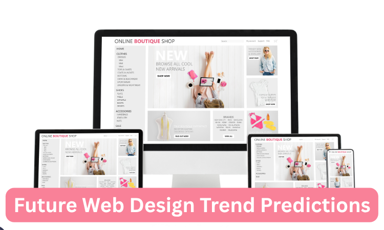
Future Web Design Trend Predictions
As AI tools become easier to use, web design may shift towards more automation. Websites might personalize content in real-time, change layouts based on mood, or adjust based on browsing style.
Motion will become lighter but smarter. Voice UI and mixed reality could find space in design. Future websites will likely become quieter in appearance but smarter behind the scenes.
Designers will focus more on emotion, ethics, and experience rather than just style. What stays constant is this: the web will keep changing, and so will design.
How BrandOut Helps You Stay Trend-Smart?
Keeping up with modern design is not easy when trends keep shifting. BrandOut’s web design services help you stay updated without losing your brand voice.
From layout choices to custom visuals, we design websites that reflect current styles and real goals.
Our team follows design trends closely and builds websites that are modern, clear, and ready for users.
Final Thoughts
Modern web design is alive, flexible, and full of personality. The trends of 2025 show a clear move toward experience, emotion, and simplicity.
From bold typography to custom animation, every choice should support the user’s journey.
These trends are not here just to look good; they help build trust, tell stories, and guide action.
As the internet keeps evolving, staying in tune with modern design helps brands stay human, relatable, and ahead of the curve.
FAQs:
What are the current trends in website design?
Modern trends include bold fonts, interactive animations, immersive 3D visuals, dark mode, and custom illustrations.
Micro-interactions and conversational UIs are also popular, helping websites feel more responsive and user-friendly.
These elements aim to create a seamless, engaging experience that keeps users interested and connected to the brand.
What is the future of website design?
Website design is moving toward smarter, AI-driven experiences. Future sites will use personalization, emotion-focused design, and faster, lighter performance.
Automation and user behavior tracking will guide layouts and features. Designers will focus more on creating meaningful, adaptable experiences that feel personal, intuitive, and emotionally aligned with user expectations.
Which design is trending now?
Currently, web design favors bold typography, animated visuals, soft UI, and gamified interactions.
Kinetic effects and drag-based navigation are also trending. These styles bring energy and flow to websites, making them more interactive.
Designers use them to build playful, modern interfaces that connect better with users across all devices.
What is the trend in website design for 2026?
In 2026, expect more AI-powered personalization, seamless mixed reality elements, and cleaner, human-first layouts.
Websites will be faster, smarter, and more adaptive to each visitor’s needs.
The trend is toward simplifying design while increasing emotional engagement and using new technology to make digital experiences more meaningful and fluid.