Your website typically provides potential customers with their first impression of your business.
A messy, outdated, or confusing site can instantly turn people away, even if your product or service is great.
The good news is that making your site look professional doesn’t require expensive tools or complex coding.
With the right approach and attention to detail, you can build trust, improve user experience, and guide visitors to take action.
Below are practical, easy-to-follow strategies to make your website look and feel professional.
Essential Website Features That Build Trust and Professionalism
Your website should not only look good but also feel trustworthy. These essential features help you create a professional, user-friendly experience that builds confidence.
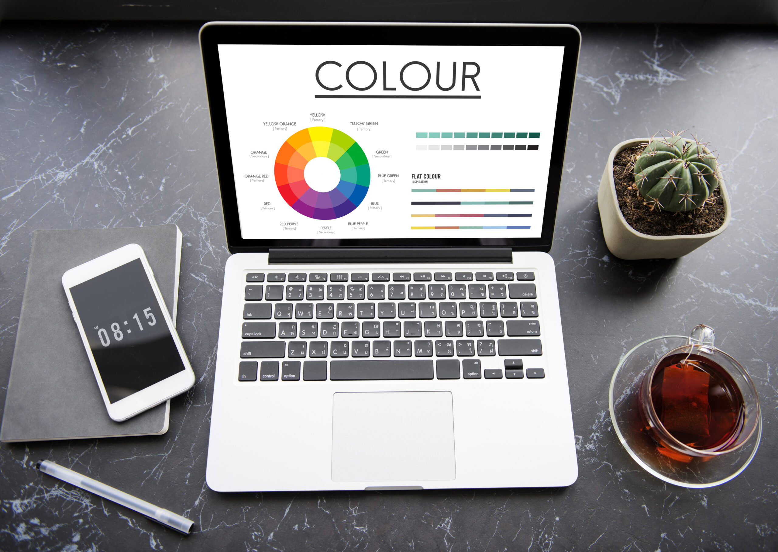
Choose the Right Color Scheme
Your website’s color palette influences how visitors feel about your brand. Use two or three consistent colors that reflect your identity.
Neutral backgrounds combined with a bright color for buttons and key areas work well. Avoid using too many flashy tones, which can distract visitors.
Ensure the background and text colors differ enough to keep the content clear and readable.
The colors should not only look good but also support the emotional tone you want to set.
Stick to a Consistent Layout
When every page follows the same structure, your website feels more organized and trustworthy.
Keep your header, footer, and content areas aligned. Use consistent spacing between elements to avoid visual clutter.
Visitors should not feel like they’re looking at a different site each time they click a link. A predictable structure also makes the browsing experience smoother.
The easier it is to navigate your site, the more likely users are to stay and engage with your content.
Write Clear, Concise Copy
The text on your website should speak directly to your audience. Avoid long blocks of text or complex terms.
Instead, use short sentences and easy-to-understand language. Break your content into sections using headings and bullet lists.
Make sure your message is focused and free of spelling or grammar errors. A clear tone helps users understand what you offer and builds a sense of professionalism.
Whether it’s your homepage or a service page, clarity is key.
Use Professional Fonts and Typography
Typography affects how people process your content. Stick to one or two clean, web-safe fonts throughout your site.
Use readable font sizes, starting at 16px for body text. Use larger, bold text for headings to highlight key sections.
Maintain consistent line height and spacing to make reading easier. Avoid using too many font styles or effects, which can look unprofessional.
When your text is visually clean and easy to follow, your whole site feels more refined.
Use High-Quality Images
Images should support your content, not distract from it. Use sharp, well-lit images that represent your brand.
Avoid generic stock photos when possible. Real photos of your product, team, or workspace create a stronger connection.
Compress images so your pages load quickly. Consistent editing or color grading helps give your site a polished look.
A few strong visuals are more effective than many average ones. Always aim for quality over quantity.
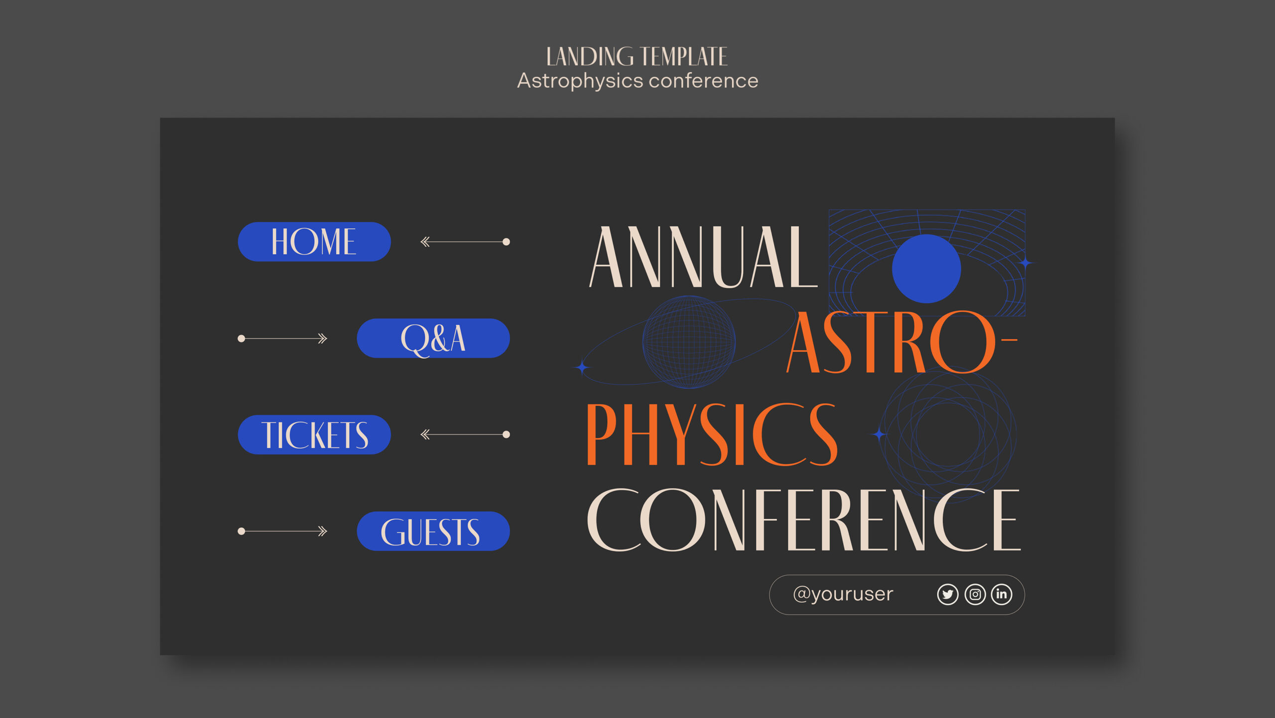
Create a Clear Navigation
Visitors should not have to guess where to click next. Keep your navigation bar simple and focused, with five to seven menu items.
Stick to simple and clear menu labels such as Home, Services, About, and Contact.
A sticky menu that stays visible while scrolling can improve user experience.
When users can find what they need quickly, they are more likely to trust and interact with your site.
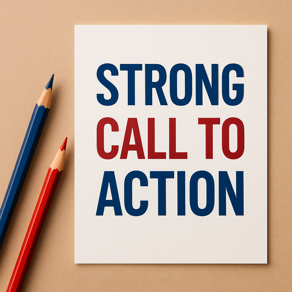
Add Strong Call-to-Actions
Every page on your website should clearly guide the visitor on what to do next.
Strong call-to-action (CTA) buttons like “Contact Us,” “Request a Demo,” or “Get a Free Quote” give users a clear path forward.
These buttons should be designed with bold colors that contrast well with the background, making them instantly visible.
Position them in high-traffic areas such as the hero section, mid-content, or the end of the page.
Use action-oriented language that is simple and persuasive. A good CTA does not just look good but also influences behavior, encourages interaction, and increases conversions.
Include Social Proof
Visitors want reassurance before taking action.
Social proof, such as client testimonials, star ratings, reviews, or case studies, helps establish trust and reduce hesitation.
Add real names, photos, company names, or even video testimonials to increase credibility.
Highlight total clients served or positive feedback received. You can even show trust badges like “Google Verified” or “Secure Checkout.”
This subtle form of validation makes visitors feel safer and more confident in choosing your business, especially if they’re visiting for the first time.
Build a Professional About Page
The About page is not just a formal requirement; it’s a key trust-building section. Use it to introduce your team and share your company’s backstory, values, and mission.
Keep the tone friendly and authentic. Add team photos, brief bios, and a snapshot of how your business began.
People prefer working with people, not faceless companies. The About page humanizes your brand and helps visitors relate to you.
It also offers a great space to explain your vision and long-term goals, making your business feel more reliable and approachable.
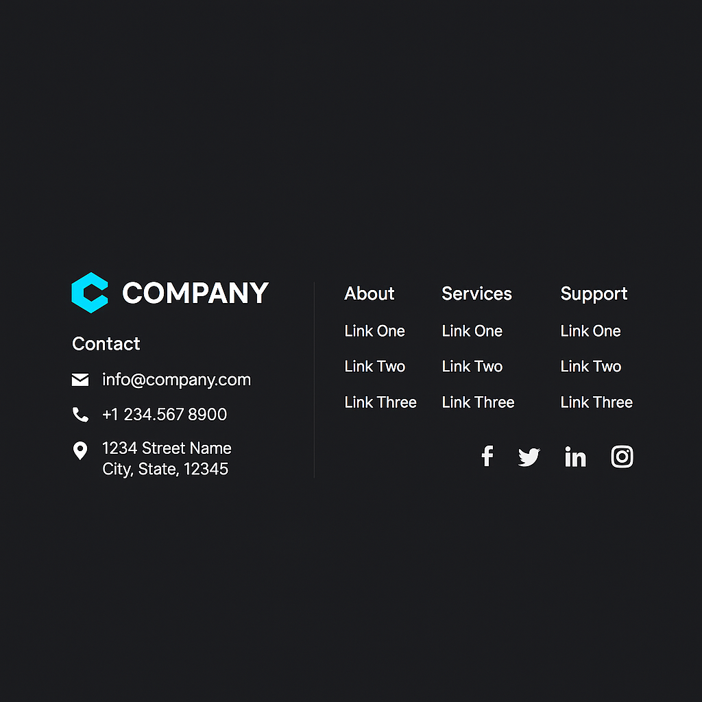
Keep the Footer Simple and Useful
A good footer acts like a second navigation bar. Instead of cluttering it with too many links or unnecessary information, focus on the essentials.
Include links to your privacy policy, contact page, terms of service, and FAQs. Add your phone number, email address, or even a compact contact form.
Include your logo and social media icons for quick access. If you have a newsletter, you can place a short signup form in the footer.
Keep the font readable, the design mobile-friendly, and the layout minimal. A clear footer layout lets visitors find key links even at the bottom of the page.
Maintain Visual Hierarchy
Visual hierarchy refers to arranging content in a way that naturally guides the viewer’s eye.
Use larger, bold headings to draw attention, followed by smaller subheadings and body text.
Make important content stand out using subtle highlights or icons. Maintain consistent spacing and alignment throughout the site to keep things tidy.
Group related content together and break long sections into manageable chunks.
This visual flow helps users quickly scan and understand your content without feeling overwhelmed.
A good hierarchy improves both readability and the user journey, making your website feel more intuitive.
Use Custom Icons and Visuals
Icons and illustrations help communicate ideas faster than text alone.
Instead of using a random mix from the internet, go for a consistent icon style across your website.
Use these icons to explain services, represent features, or illustrate steps in a process.
Custom visuals add a personal and polished feel. You can also use vector illustrations to make your site stand out.
Avoid unnecessary clutter and focus on visuals that truly support the content. Done right, icons can improve engagement and simplify information.
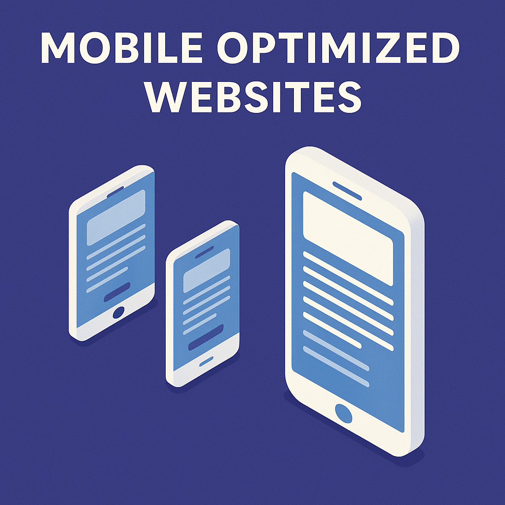
Optimize for Mobile Devices
With more users browsing from their phones, mobile responsiveness is no longer optional.
Your website must adapt to all screen sizes, from large desktops to small smartphones.
Ensure that fonts are readable without zooming, buttons are easy to tap, and images resize smoothly.
Use responsive menus, avoid pop-ups that block content, and test your pages on multiple devices.
A well-optimized mobile site leads to longer visit times, fewer bounces, and a better overall experience.
It also improves your chances of ranking higher in search engines since mobile-friendliness is a known ranking factor.
Highlight Your Unique Selling Points
Your unique selling points highlight what sets you apart and give customers a clear reason to pick your business instead of competitors.
List these in a dedicated section on your homepage or service pages. Keep them short, specific, and relevant to your audience.
Examples include 24/7 customer support, same-day delivery, or industry-certified staff. Use icons, badges, or checkmarks to make each point stand out visually.
This section should be placed in an area of high visibility and written in simple, benefit-focused language.
Strong USPs help visitors quickly understand your value and increase their chances of taking action.
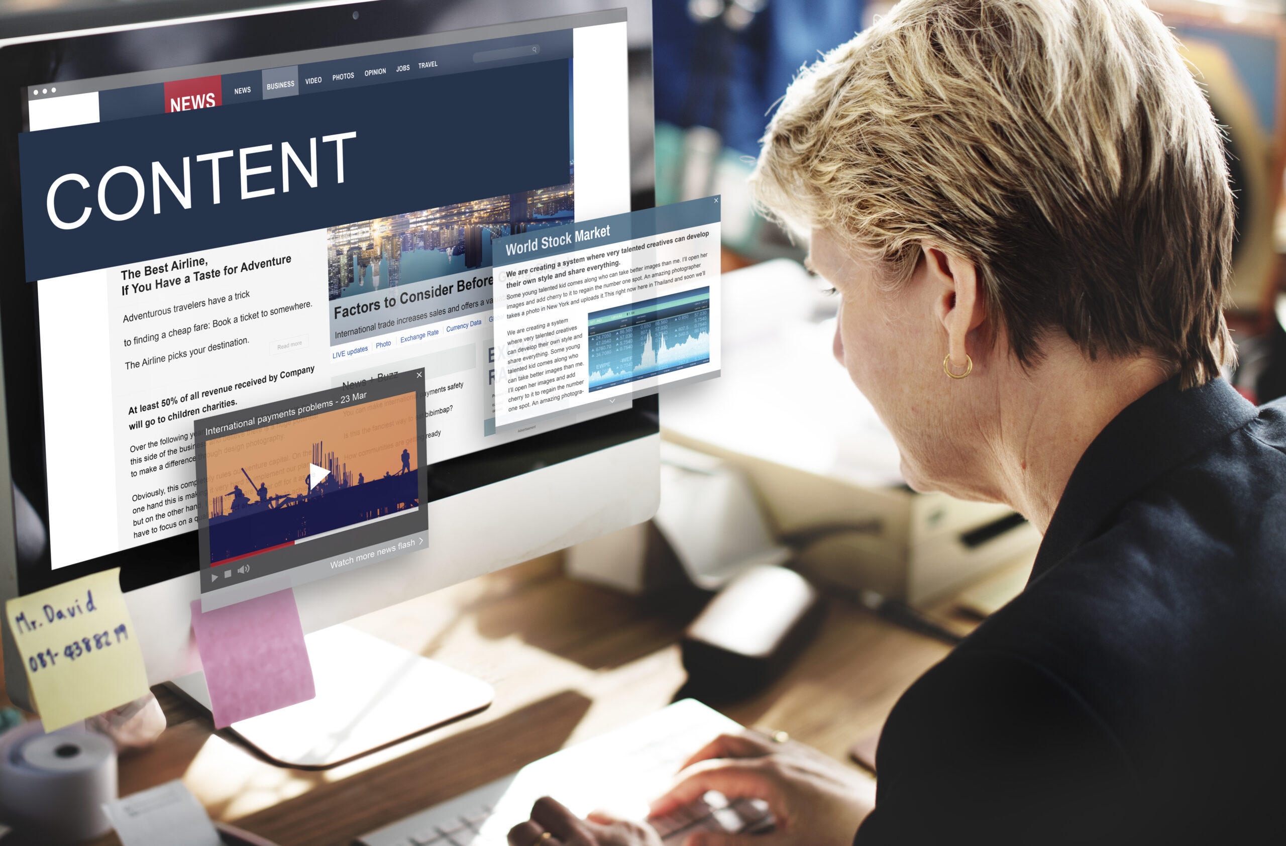
Add a Blog or Resource Page
A blog is not just for SEO; it helps educate, inform, and build trust with visitors.
Share posts that answer common questions, offer solutions to pain points, or update users about your services.
Break content into sections using headings, bullet points, or visuals. Organize posts into categories so users can easily find what they’re looking for.
A regularly updated blog also shows that your business is active and engaged.
Over time, these articles can establish your expertise, attract organic traffic, and improve visitor retention.
Update Content Regularly
Stale or outdated content makes your website look neglected. Check your pages every few months to ensure accuracy.
Fix broken links, update product or service details, refresh staff bios, and remove expired promotions.
A current website signals to search engines that your site is active, which can boost visibility.
Set a reminder or schedule routine audits to review your content. Visitors are more likely to trust and engage with a business that keeps its information fresh and relevant.
Do you need help making your site look this professional?
If your website feels outdated or lacks structure, Brandout’s Custom WordPress Development service is built to fix that.
We build smooth, modern, and easy-to-use websites shaped around your specific business needs.
From layout and mobile responsiveness to visuals and usability, we make sure every detail works together to leave a lasting impression.
Conclusion:
A professional website doesn’t depend on flashy design. It relies on clear messaging, simple structure, and thoughtful presentation.
Focus on consistency, trust, and ease of use. Small changes in layout, colors, images, and copy can create a big difference in how people view your brand.
A clean and updated website helps visitors stay longer, feel confident, and take the action you want.
Most Asked Questions:
What are the 5 golden rules of web design?
- Keep it simple
- Make it mobile-friendly
- Ensure fast loading speed
- Use consistent branding
- Guide users clearly
How do I know if my website looks unprofessional?
Slow speed, cluttered layout, outdated visuals, or poor mobile experience are signs your site needs improvement. A professional site should be clear, easy to use, and visually balanced.
Will my new website work well on mobile devices?
Yes. All our WordPress websites are fully responsive, ensuring a seamless experience on mobiles, tablets, and desktops.
How long does it take to complete a custom website?
Project timelines depend on features and size, but most websites are completed within 2 to 4 weeks with regular updates along the way.