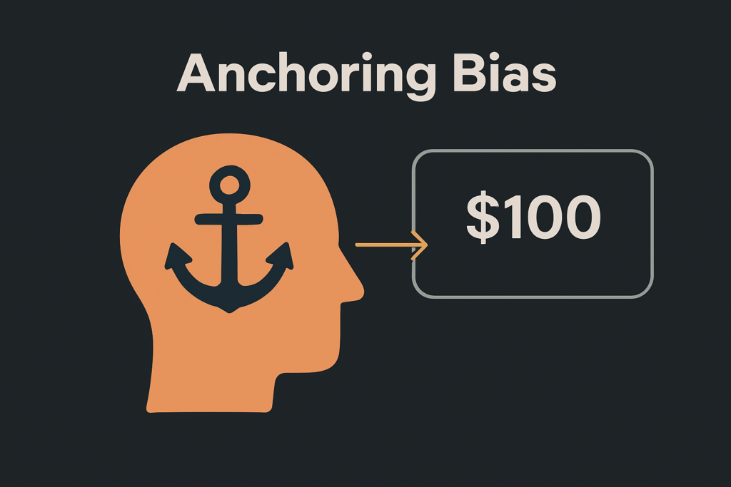
Anchoring bias is a cognitive tendency in which initial information strongly influences subsequent decisions.
In user experience design, this bias significantly influences how users perceive pricing, options, and features.
The initial value or element they see becomes their reference point, often influencing their final choice more than they realize.
Understanding this bias is essential for creating interfaces that guide decisions effectively while maintaining user trust.
What is anchoring bias in UX?
Anchoring bias occurs when people place excessive importance on the first information they see, which affects their subsequent choices.
In UX design, this means the initial element, price, or option presented can strongly influence user behavior.
Even if better alternatives appear later in the process, users often stick to the anchor because it sets their mental reference point.
For example, if a pricing page shows a premium plan first at $199 per month, users may perceive the $99 plan as affordable, even if $99 is higher than what they initially expected to spend. That first price becomes their anchor.
Why Does Anchoring Matter in UX Design?
Anchoring matters because it directly affects conversions, satisfaction, and user choices.
Users rarely evaluate every option objectively. They make decisions based on the reference point you set.
This can be intentional to guide behavior or unintentional, leading to friction.
When applied ethically, anchoring can help users choose the right plan or product faster.
If applied poorly, it can create frustration and mistrust. For example, if the first anchor feels manipulative or irrelevant, users may leave the experience completely.
Real-World Examples of Anchoring in UX
Discover practical examples of anchoring in UX, from pricing pages to e-commerce discounts and form inputs, and learn how they shape user decisions.
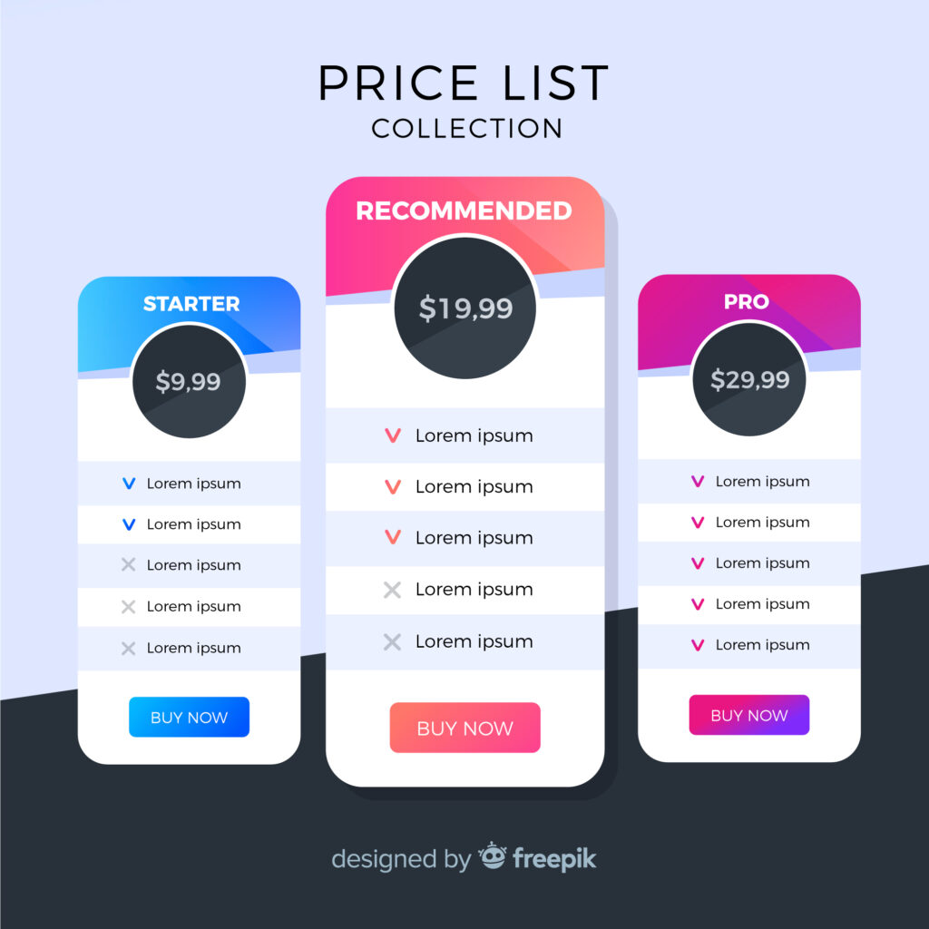
Pricing Pages
Pricing pages are one of the most common places where anchoring bias is used effectively.
Many subscription-based services display the highest-priced plan first.
This sets an initial reference point that makes all subsequent options seem more affordable in comparison.
For example, if the first option is a premium plan at $199 per month, the next plan priced at $99 feels like a great deal, even if $99 was beyond what the user initially intended to spend.
This technique helps businesses influence customer choices without changing the actual value of the plans.
E-Commerce Discounts
Online stores frequently use anchoring to make discounts look more appealing.
One of the most common techniques is showing the original price crossed out, followed by the discounted price in bold.
For example, an item priced at $200 with a strikethrough and then shown as $129 creates a sense of urgency and value.
The original price acts as an anchor, making the discount appear significant even if the actual difference is not as large as perceived.
This psychological trigger encourages users to complete the purchase quickly, believing they are getting an exclusive deal.
Form Inputs
Anchoring bias also appears in form fields, especially in tipping or donation sections.
A common practice is pre-filling suggested values like “Tip 20%” or showing multiple suggested amounts such as $50, $100, and $200.
Most users tend to pick a value near the default or the first suggestion because it feels like the norm.
For example, if the default tip is 20%, many people leave it unchanged, even if they would have tipped less without the suggestion.
This simple design choice strongly influences user decisions and can significantly impact the final contribution amount.
How Anchoring Bias Impacts Decision-Making in UX
Learn how anchoring bias affects decision-making in UX by influencing perception, speed, and user behavior through strategic design choices.
Sets the Mental Reference Point
Anchoring bias creates a mental benchmark as soon as the first element appears on the screen.
Users naturally compare all subsequent options to this initial reference rather than judging each independently.
This reduces their ability to evaluate choices objectively and can speed up decision-making.
While this can make the experience feel effortless, it often leads to decisions based more on perception than actual value.
For designers, this means the first option or price shown has tremendous influence over how users interact with the rest of the content.

Example: Pricing Influence on Perception
Imagine a hotel booking platform that displays “Rooms from $500” as the very first option.
Even if the user initially planned to spend much less, the next option priced at $300 appears like a bargain because it is being compared to the $500 anchor.
The actual price of $300 might still be above the user’s budget, yet it feels acceptable because the reference point shifts their perception.
This example illustrates how a single high anchor can change how users interpret affordability and value.
Example: Donation Amount Selection
Anchoring also impacts decisions on donation pages. When the first suggested amount is $100, many users will select it or an amount close to it, even if they originally intended to give less.
If the first option were $20 instead, the average donation would likely be lower.
This happens because the initial suggestion becomes the benchmark for what feels “normal” or “reasonable.”
By presenting a higher anchor, platforms can encourage larger contributions, but designers must balance persuasion with fairness to avoid damaging user trust.
Business Impact and Ethical Considerations
Using anchoring bias can increase conversions and drive higher revenue because it nudges users toward preferred choices.
However, applying it without regard for user experience can backfire.
If users feel misled by unrealistic anchors, they may abandon the process or develop negative feelings toward the brand.
Ethical use of anchoring should always align with user expectations and provide real value.
When done correctly, anchoring can guide decision-making in a way that benefits both the user and the business without sacrificing transparency or trust.

Best Practices for Designers
Here are essential tips for designers to apply anchoring effectively and ethically while creating simplified user journeys.
Be Intentional with Anchors
Anchors are powerful because they shape the user’s perception from the very first interaction.
Designers should decide in advance what impression they want to create and ensure the anchor aligns with that goal.
For example, if you want to encourage users to choose a mid-tier plan, displaying a higher-priced option first can make the middle choice look more attractive.
However, the anchor must not feel misleading or manipulative.
A thoughtful approach ensures that users make decisions confidently while maintaining trust in your product or brand.
Test Multiple Anchors
The impact of an anchor changes based on factors like the target audience, the situation, and the type of product.
Designers should run A/B tests to compare different anchor points, such as showing the highest price first versus highlighting the most popular plan.
These tests provide valuable data on user behavior and conversion rates, helping you identify the most impactful positioning.
Without testing, you might rely on assumptions that do not work for your audience.
Experimentation ensures that your anchoring strategy is evidence-based and optimized for real-world performance.
Maintain Transparency
While anchoring can influence choices, it should never feel deceptive.
Users value honesty and clarity, and any hint of manipulation can harm credibility.
For example, avoid inflating prices artificially to make discounts seem larger than they really are.
If users sense that the anchor was designed purely to exploit them, they may abandon the site or lose trust in your brand entirely.
The best approach is to present anchors that are realistic and relevant so the user feels guided, not tricked, throughout the decision-making process.

Use Anchoring to Simplify Choices
In complex flows where multiple options can overwhelm users, anchors provide a helpful starting point.
For instance, a subscription page with three tiers can highlight the recommended plan first, making it easier for users to focus.
This reduces decision fatigue because the brain needs fewer resources to evaluate every choice.
When implemented properly, anchoring not only improves conversions but also creates a smoother and more enjoyable experience.
The key is to use it as a guide for clarity, not as a psychological trap.
How can Brandout help businesses use anchoring effectively in UX design?
Brandout helps businesses apply anchoring effectively through specialized UX design services that combine user psychology with practical design strategies.
Our team creates intuitive interfaces, strategic pricing layouts, and clear visual hierarchies that guide user decisions without compromising trust.
We ensure every design element is intentional, making choices easier for users while driving better engagement and conversions for businesses.
Conclusion
Design goes beyond visual appeal; it focuses on influencing perception and directing decisions.
Anchoring bias shows how powerful the first impression can be in influencing behavior.
While this principle can boost conversions, its true strength lies in using it responsibly to create clarity, not confusion.
When users feel informed rather than manipulated, they trust the experience and return willingly.
The goal is simple: design with psychology in mind, but always keep honesty at the core. In the end, the most effective anchors are those that guide, not trap.
Most Asked Questions:
How does anchoring bias influence user behavior?
Anchoring bias influences user behavior by shaping their perception of value. For example, if the first price they see is high, lower-priced options appear more affordable, even if they are still expensive compared to the user’s initial expectation.
Is using anchoring bias in UX ethical?
It is ethical when used to simplify decisions and provide clarity rather than mislead users. Clarity and honesty are crucial for preserving user trust when using anchoring strategies.
What are common examples of anchoring in digital products?
Common examples include showing the most expensive plan first on pricing pages, displaying original prices with strikethroughs during sales, and suggesting pre-filled tip amounts or donation values in forms.