
Design systems have become an essential part of building SaaS platforms that grow without losing consistency.
A scalable design system brings structure to design processes, making it easier to maintain visual harmony and usability across multiple features and updates.
It helps designers and developers work efficiently, reduces duplication, and ensures a unified user experience as the platform evolves.
Understanding how to plan, organize, and implement a design system can transform the way digital products scale and improve overall performance.
Why We Need a Scalable Design System for SaaS
SaaS products evolve continuously, with frequent feature additions, interface improvements, and integration updates.
Without a design system, teams may face inconsistent designs, repetitive work, and higher development costs. A scalable design system:
- Keeps design consistent across different modules.
- Speeds up design and development cycles.
- Makes it easier for new team members to adapt.
- Supports product growth without redesigning from scratch.
Essential Components for a Successful Design System
Below are some core elements that keep a SaaS platform’s design consistent, flexible, and ready to grow.
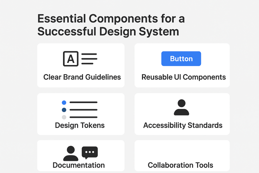
Clear Brand Guidelines
Brand clarity is the starting point for building a design system.
They define how a SaaS platform presents itself visually and ensure every element reflects the company’s identity.
These guidelines cover core aspects like logo usage, color palettes, typography, and imagery style.
Consistency in these elements helps users instantly recognize the brand and builds trust over time.
Guidelines also prevent design drift when multiple designers work on the product.
They act as a reference for creating marketing materials, UI screens, and digital campaigns.
For scalability, brand guidelines should be well-documented, easy to access, and updated regularly to match evolving brand strategies without disrupting the overall look and feel.
Reusable UI Components
Reusable UI components are pre-designed, standardized elements like buttons, forms, navigation bars, and modals that can be used across a SaaS platform.
They save time by eliminating the need to design the same elements repeatedly, allowing teams to focus on new features instead.
Consistency is a major benefit, as components maintain the same styling and functionality throughout the application.
Well-structured components are also easier to maintain and update.
For example, updating a button style in the component library automatically applies the change across all instances.
This approach improves speed, reduces development errors, and creates a cohesive user experience across multiple devices and modules.
Design Tokens
Design tokens are the basic, reusable style elements saved as variables, including properties like colors, font sizes, line heights, and spacing.
They act as a single source of truth for styling across a SaaS platform.
By using tokens, designers and developers can quickly update a style without manually editing every component.
For example, changing a primary color in the token file will update all instances using that token, ensuring instant consistency.
Tokens are especially valuable for scaling design systems, as they work seamlessly across platforms and devices.
They also improve collaboration between design and development teams by creating a shared, easily maintainable styling structure.
Accessibility Standards
Accessibility standards ensure that a SaaS platform can be used by everyone, including people with disabilities.
This includes providing proper contrast between text and background, using readable font sizes, and ensuring keyboard navigation works properly.
Adhering to standards such as WCAG (Web Content Accessibility Guidelines) also benefits SEO and user satisfaction.
Accessibility should be integrated into the design system from the very beginning, rather than being addressed later as an afterthought.
Components should be tested with screen readers, and interactive elements must have clear labels.
A truly scalable design system makes accessibility part of every design decision, ensuring inclusivity and a better experience for all users.
Documentation
Documentation is the backbone of a design system, explaining how each component, style, and pattern should be used.
Without documentation, even the best design systems can become confusing, leading to inconsistent results.
Good documentation includes visual examples, usage guidelines, do’s and don’ts, and code snippets for developers.
It should also explain the reasoning behind design choices, helping new team members quickly understand and adopt the system.
Hosting documentation on an accessible platform ensures designers, developers, and stakeholders can reference it anytime.
Regular updates are critical to keep the documentation aligned with product changes, making it a living resource rather than a static file.

Collaboration Tools
Collaboration tools bridge the gap between designers, developers, and other stakeholders in building and maintaining a design system.
Tools like Figma or Sketch allow designers to work together in real time, while Storybook and Zeroheight help developers and designers sync design and code.
Communication platforms like Slack or Microsoft Teams can be integrated for quick feedback loops.
These tools ensure everyone is aligned, reducing miscommunication and delays.
A scalable design system relies on smooth collaboration to evolve effectively, and the right tools make this possible.
Centralizing work in shared platforms also makes onboarding easier for new team members and speeds up project delivery.
Design Creation Process for SaaS platform:
Building a scalable design system for SaaS involves these key steps:
1. Research and Audit Existing UI
Begin by reviewing your existing user interface to spot any inconsistencies.
Collect all design elements such as colors, typography, icons, and components.
Analyze how these elements behave across different screens and devices.
Identify design patterns, point out duplicate styles, and assess areas where the user experience can be improved.
This process gives you a clear understanding of what needs improvement and what should remain.
The main objective here is to ensure your design system is built on real insights rather than assumptions.

2. Define Core Design Principles
Every design system needs a strong foundation of principles that guide decisions.
These principles should reflect your brand identity and product goals.
For SaaS platforms, focus on simplicity, consistency, scalability, and accessibility.
Document these principles clearly so everyone on the team follows the same guidelines.
Include accessibility requirements such as WCAG standards and responsive behavior.
These principles ensure alignment across all future design and development activities.
3. Build the Style Foundation
The style foundation defines the visual language of your SaaS platform.
Start by creating a color palette that includes primary, secondary, accent, and neutral shades.
Set rules for typography such as font families, sizes, and hierarchy for headings and body text.
Create a spacing framework and layout grid to ensure uniform alignment throughout the design.
Do not forget interactive states like hover, focus, and error indicators. These fundamentals make your brand identity strong and adaptable for future growth.
4. Create Core Components
After setting the style foundation, build reusable UI components.
These include elements such as buttons, inputs, dropdowns, and modals.
Follow the atomic design method, starting from basic elements and progressing to complex structures.
Design these components to be responsive and accessible from the beginning.
Include states like default, active, disabled, and hover for clarity.
Reusable components improve development speed and maintain design consistency across the entire SaaS platform.
5. Document Everything
A design system without proper documentation is difficult to maintain. Use tools like Figma, Storybook, or Zeroheight to document every detail.
Include component descriptions, usage rules, and examples of correct and incorrect implementation.
Explain how colors, typography, and spacing should be applied.
Good documentation makes it easy for new team members to adopt the system and reduces confusion across teams.
6. Implement Tokens and Variables
Design tokens store values such as colors, typography, and spacing in a single source of truth.
They make it easier to maintain consistency between design and development.
Instead of hardcoding styles, use tokens like color-primary: #0052cc.
Connect these tokens to the code using tools like Style Dictionary or CSS variables, so any token update is applied across all instances automatically.
When you update a token, the changes reflect everywhere automatically. This approach is essential for scalability and future updates.

7. Test Across Devices and Platforms
Testing ensures your design system works consistently across devices and browsers.
Check how components behave on desktops, tablets, and mobile screens.
Validate responsiveness, alignment, and readability for all screen sizes.
Perform accessibility testing for contrast, keyboard navigation, and screen reader support.
Use tools like BrowserStack or Chromatic for visual and functional testing. Proper testing guarantees a consistent experience for all users.
8. Create a Governance Model
A governance model keeps your design system organized and up to date.
Define clear guidelines for adding new components and updating existing ones.
Set up a review process to maintain quality and prevent inconsistency. Track changes with version control so updates are documented.
A governance model ensures that as your product grows, your design system remains consistent and scalable.
9. Integrate with Development
Integration with development teams is critical. Work with developers to build component libraries for frameworks such as React, Vue, or Angular.
Use tools like Storybook to connect design and code visually. Set up visual regression testing to detect changes early.
Developers should be able to use ready-to-go components directly from the design system, which speeds up development and reduces errors.

10. Maintain and Scale
A design system is a continuous process, not a one-time project.
Schedule regular reviews to remove outdated patterns and add new components as your product evolves.
Keep documentation up to date and collect feedback from designers, developers, and users.
Assign dedicated ownership to ensure the design system grows with your SaaS product and remains relevant over time.
Are you looking for a scalable design system that strengthens your SaaS platform’s identity and performance?
BrandOut’s UI/UX Design service creates scalable design systems for SaaS platforms, ensuring your brand identity remains strong while enhancing performance and user experience.
We create reusable components, clear guidelines, and a consistent visual style to support fast growth without compromising quality.
Conclusion
Building a scalable design system for a SaaS platform is not a one-time task but an ongoing process that grows with your product.
A well-structured system brings consistency, speeds up development, and ensures a seamless user experience across devices.
From auditing your existing UI to creating reusable components, documenting every detail, and setting clear governance, each step plays a crucial role.
When implemented correctly, a design system becomes more than a design framework; it becomes a powerful tool that aligns teams, reduces redundancy, and supports rapid product evolution.
Invest time in building it right, and your SaaS product will remain consistent, flexible, and ready to scale for the future.
Most Asked Question:
What is a scalable design system in SaaS?
A scalable design system in SaaS is a structured collection of components, guidelines, and assets that can grow and adapt as the platform evolves, ensuring consistent design across all features and updates.
How does a scalable design system save time for SaaS teams?
By reusing pre-built components and standardized styles, teams can design and develop features faster. This reduces the need for repetitive work and speeds up product updates.
Can a scalable design system improve user experience in SaaS?
Yes. Consistent visuals and predictable interactions make the platform easier to navigate, increasing user satisfaction and reducing confusion.
What challenges come with creating a scalable design system for SaaS?
Common challenges include aligning design and development teams, keeping documentation updated, and ensuring the system remains flexible for future changes.
How often should a SaaS design system be updated?
It should be reviewed regularly, ideally every few months, to incorporate new patterns, remove outdated components, and adapt to evolving product needs.